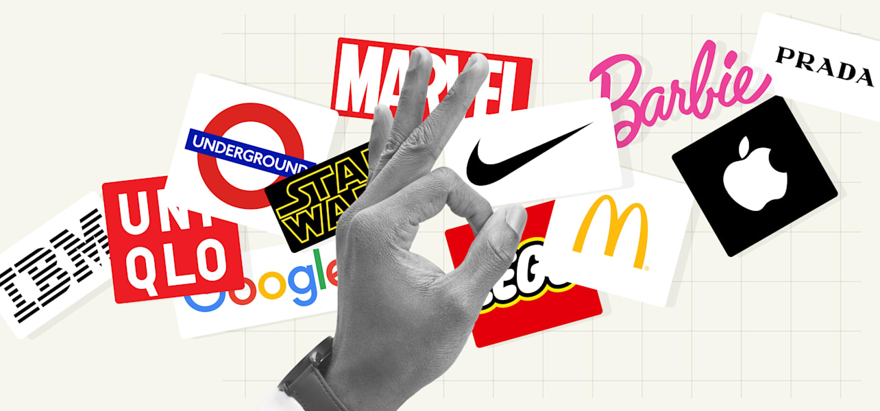
The most recognizable and famous logos belong to some of the most well-known organizations and brands. These popular logos often aren’t the most complex in design, but carry hidden meaning, are highly memorable and make a lasting impact.
Whether they’ve remained largely unchanged since the brand’s beginning, have been gradually refined over time or look completely different from the original, these iconic logos reveal what makes a visual identity truly effective. Watch our video on the world’s most famous logos and explore our list for inspiration for your next custom logo design.
- The most iconic logos are simple yet meaningful, such as Nike’s swoosh, which suggests movement and victory, and Apple’s bitten apple logo, symbolizing knowledge and innovation.
- Great logos stand the test of time by avoiding logo trends and sticking to classic design principles.
- A strong logo remains clear and recognizable, whether it’s on a billboard or a business card.
- Memorable logos often use clever design tricks, like hidden symbols or visual illusions, to add depth and meaning. Many famous logo sketch processes begin with exploring these visual ideas by hand.
- The best logos reflect a brand’s personality, values or story, often with just a few well-chosen elements.
40 famous logos and what you can learn from them
1. Nike
Nike’s swoosh, designed by Carolyn Davidson, is one of the most iconic and popular logos. The swoosh mimics the wings of Nike, the Greek goddess of victory and the company’s namesake. It also resembles a checkmark, signifying success of completion (in other words, “Just do it”).

Source: Nike logo via Wikimedia Commons
With its fluid silhouette that suggests motion and speed, the Nike swoosh is a great example of how even the most minimal and abstract logo designs can carry meaning and communicate brand values.
At the beginning of your logo journey? Discover what a logo is and why it’s important for your brand.
2. Chanel
Chanel is a fashion brand synonymous with luxury, elegance and Parisian chic. The interlocking Cs represent the initials of the iconic French founder, Coco Chanel.

Source: Chanel logo via Wikipedia
The black and white logo, with the wordmark often placed underneath, is surrounded by negative space, with no added effects or embellishments, just clean symmetry. Its simplicity is what makes the iconic logo so powerful, allowing it to communicate Chanel’s brand values decades after it was originally designed.
3. McDonald’s
The famous McDonald’s logo, also known as the Golden Arches, was inspired by the fast food chain’s original restaurant design, turning the two arches into a lettermark logo, an M.

Source: The McDonald’s logo is one of the most recognizable logos in the world via McDonald’s
What’s the difference between a wordmark and a lettermark logo? Read our guide to understand the different types of logos and how to use them.
Over its signature red background, the McDonald’s logo has a 50s drive-in aesthetic, in line with the chain’s brand identity. It’s on their packaging, uniforms, signage and billboards; any communication that involves McDonald’s involves this logo.
Be consistent and keep your branding cohesive across all marketing materials.
4. Apple
From the bible to the apple that fell on Isaac Newton’s head, apples often carry significant symbolism. Why Apple chose an apple as its pictorial mark and why it has a bite in it has inspired legends, from being the cyanide-laced apple that Alan Turing bit into to a visual pun on a “byte.”

Source: Apple logo via Wikimedia Commons
The logo designer, Rob Janoff, has said that the bite was an easy way to distinguish the apple from other fruit. But the fact that the logo is associated with several myths tells a story in itself. The iconic logo bridges age-old wisdom with the sleek, modern design that Apple is famous for.
5. Shell
The Shell logo, also known as “The Pecten” after the large shell mollusk on which it was based, is another example of the power of word-object association. Despite the company’s logo changing over the years, the image of a single seashell has remained. The original Shell logo design was trademarked in 1900 and is the oldest of 22,000+ trademarks owned by Shell.

Source: The red and yellow shell logo via Shell
6. Starbucks
Starbucks’ Siren emblem logo design is based on epics and myth-making, with the founders choosing the name Starbucks after the Moby Dick character. After looking for a mythical creature that represented their company in old marine books, they decided on the siren. These nautical references are also harmonious with the company’s place of origin, the major port city, Seattle.

Source: The Starbucks logo via Starbucks
Incorporate characters into your logo design to add personality and warmth, creating a richer brand persona and helping audiences connect with and remember your brand. As seen in the Starbucks logo, using cultural or mythical references in logo designs can make them more memorable.
7. Toblerone
Toblerone’s famous logo is an example of great branding for several reasons. The bold wordmark logo font and mountain motif are easily recognizable, communicate the brand’s Swiss roots and are linked to the chocolate’s unique triangular shape.

Source: The Toblerone logo via Wikimedia Commons
The logo also has an optical illusion that’s easy to miss but hard to unsee. In the negative space of the Toblerone mountain hides a bear. Clever branding tactics like this can draw attention to the brand and strengthen marketing.
8. Coca-Cola
Two components of the iconic Coca-Cola logo have always stayed pretty much the same—a flowing, cursive wordmark with a wave or ribbon-like tail underlining the first C. The logo font feels retro, but not dated.

Source: Coca-Cola logo via Coca-Cola Company
9. NASA
NASA’s spherical logo, coined “The Meatball,” was the original logo design and the one associated with the first moon landing, the brand’s most iconic era. The popular logo in the colors of the American flag depicts a planet-like silhouette with stars and orbits.

Source: The original and current NASA logo via NASA
Between 1975 and 1992, the original logo was replaced with “The Worm”, a wordmark logo with continuous, curvy letters that echo the movements of a worm. It now looks a little retro and Star Wars-esque, but when it was released, the red logo was contemporary, minimal and futuristic.

Source: The NASA logo, 1975-1992, via NASA
When it reverted back to the original logo, NASA tapped into nostalgia branding, saving the worm logo design for their rockets, recognizing the strong associations that audiences make with their famous logos.
10. The London Underground
London Underground’s famous logo, also known as “The Roundel,” was designed over a century ago. It was simplified from the original image of a wheel and uses the original Johnston Typeface, with sans-serif letterforms for optimum legibility.

Source: The London Underground logo via Transport for London
The tube logo has color variations for different stations and modes of transportation, with the red and blue logo as its main design. Overall, the minimal symbol is accessible, easy to understand and reliable; everything you would want from public transportation.
11. IBM
IBM’s 8-bar logo, designed by Paul Rand (who also designed logos for UPS, Enron and Westinghouse), has remained unchanged since its creation. The bold, capital serif letters convey authority and confidence, while the stripes suggest speed and innovation. At the time, this use of negative space was groundbreaking; today, it taps into nostalgia.

Source: The IBM logo via IBM
12. Prada
Luxury fashion powerhouse Prada treasures its original wordmark logo so much that it’s never changed. This is typical of brands with emblem logos (designs that integrate text and imagery within a unified shape), which signify tradition and legacy. The Prada emblem’s simple, angular outer shape contains its wordmark, a coat of arms and a ribbon.

Source: The Prada logo via Wikipedia Commons
The Prada wordmark logo font’s letterforms are blocky and angular with varying weights, creating a feel of flow and movement.

Source: The Prada logo via Wikipedia Commons
13. PlayStation
When PlayStation decided to focus on 3D polygon graphics, its logo needed to communicate this shift. Designer Manabu Sakamoto created a logo featuring an optical illusion perfect for a gaming brand: an upright P and an S that lay at an angle at its feet.

PlayStation’s unique twist on a wordmark logo. Source: via PlayStation
The logo features primary colors red, blue and yellow, with green as a transition in between. The optical trick of depth was adventurous, helping PlayStation to convey the message that it was a brand committed to new technology and more innovative than its competitors.
14. The Olympics
Across the globe, the five interlocking rings of the Olympics logos represent the coming together of five continents in celebration of sport. Each ring is a different color, communicating diversity and unity. The Olympics logo is a brilliant example of cross-cultural design, using universal symbols and careful color choices.

Source: The Olympic rings represent the Olympic Games via the International Olympic Committee
How do you achieve a logo design that works across cultures? Research your market and ensure the colors, shapes and icons you use have universal positive associations in different cultures.
15. Marvel
Marvel introduced its bold red and white wordmark logo in the early 2000s, the new face of legendary comics for a new millennium. Marvel is in bold white letters over a bright red background with letters close together, sometimes overlapping or connecting, creating a sense of force and urgency, much like a superhero called to action.

Source: Marvel’s bold wordmark logo via Marvel Comics
16. Amazon
Amazon’s famous wordmark logo is straightforward with just the right amount of detail to express its brand identity.

Source: The Amazon logo via Wikimedia Commons
The clean black and white, lower-case logo is easily legible. The arrow connects a to z with one swift move, just like the customer experience. This arrow is sometimes called “the smile,” adding a friendly touch to the logo design. The gentle curve below the z, where the arrow lands, brings a sense of motion to the design.
Amazon’s logo can be condensed into a favicon (the icon on a URL, tab or webpage). Designing a logo that can be simplified into a smaller icon is smart, especially for a digital product.
17. Barbie
The bright pink Barbie logo was created by its founders in 1959, featuring a playful cursive sans-serif typeface, a style new to the toy doll industry.

Source: The Barbie logo design via Wikimedia Commons
The Barbie logo was designed to speak directly to children, conveying fun and playfulness. Though redesigned several times, the company eventually returned to the original retro logo, a key part of Barbie’s iconic aesthetic. This timeless, style-driven logo has carried Barbie through changing eras and evolving products.
18. Google
Google shared the newest version of its famous logo in 2015. The update involved a logo that worked with responsive design, meaning it could fit any screen without compromising its integrity. With each update, the logo has been simplified more and more.

Source: Google logo via Wikipedia
It’s also a logo that lends itself to alterations while retaining its basic structure—the Google Doodle. Having a basic and simple yet dynamic logo gives a company the freedom to play around with the design. This dynamism also lends the logo (and the company) ongoing relevance.
19. Pepsi
The Pepsi logo, the Pepsi Globe, originally inspired by its bottle cap, employed red, white and blue to evoke American patriotism during World War II.

Source: Pepsi logo via Pepsi
Pepsi’s logo history began with a cursive wordmark and later switched to a modern sans-serif font to distinguish it from its rival, Coca-Cola. The spherical symbol remained to show customers it was the same brand, just refreshed and improved, helping maintain trust.
20. Tate
The Tate’s original wordmark logo helped establish the brand, with a unique blur effect later introduced by lead designer Marina Willer, designed to draw viewers’ attention.

Source: Tate logo via Tate
The team created 75 variations of the same logo, each slightly more in or out of focus. This idea, although original, caused some organizational confusion, and so in 2016, the logo was simplified for the sake of consistency.
21. National Geographic
A great deal of market research went into creating the simple National Geographic logo, with a recognizable, versatile identity being the top priority for design agency Chermayeff & Geismar. They decided to include the magazine’s iconic gold border within the logo, along with the all-caps serif font. The iconic logo is simple enough to be placed on any background, ideal for the magazine’s legendary photographs and covers.

Source: National Geographic logo via Wikipedia Commons
22. Mercedes-Benz
The Mercedes’s three-point star held personal meaning for the owners’ family; it was a symbol their late father used to mark their family home and later represented land, sea and air.
Source: Mercedes Logo via Wikipedia Commons
This famous logo stands out with its distinctive shading and 3D metallic look, giving it depth and shine. Enclosed in a circle that touches all three points, the iconic logo design conveys completeness and balance.
23. Instagram
The Instagram logo is also its app icon, meaning this little camera symbol has represented the company through its massive business growth.
Source: Instagram logo via Meta
Because the app was created to take and share photographs instantly (hence “Insta”), the symbol was modeled after a Polaroid camera. The logo is still in the shape of a Polaroid camera, just depicted more abstractly than in the original design.
24. FedEx
The simple FedEx logo is known for its smart design, cleverly using negative space to create an arrow between the E and x. This arrow communicates speed, direction and a smooth, hassle-free delivery service.

Source: FedEx logo via FedEx
25. Mastercard
Because credit cards all have a similar shape, necessary for fitting in wallets and machines, distinguishing one from another relies on the design elements on the card.

Source: Mastercard logo via Wikipedia Commons
Mastercard created an iconic brand symbol with its two interlocking circles. Despite the company refining its logo over time, the circles remained, with clever color layering adding depth to the simple design. These small touches help make the logo memorable and instantly recognizable.
26. Disney
The Disney wordmark logo is the signature of the founder, Walt Disney, with calligraphic touches to inspire imagination and evoke a sense of magic, appealing to an audience of children and nostalgic adults.

Source: The Disney Plus logo via Disneyplus
A calligraphic wordmark logo design expresses personality and humanity. This is useful for companies that want to emphasize their human side.
27. Formula 1
The original red, black and white Formula One logo was designed when the car race gained international recognition and notoriety. The logo was eye-catching and successful for several reasons: its italicized font, with the red “1” made up of tiny arrows, conveying the movement, energy and speed synonymous with the famous brand.

Source: The original F1 logo via Wikipedia Commons
Source: The latest F1 logo via Wikipedia commons
The F1 logo update has simplified the design to align with the contemporary minimalist monogram logo style.
28. WWF
The conservation organization WWF’s panda logo is one of the world’s most famous logos. The black-and-white logo design features a panda named Chi Chi, as pandas are an endangered species, and WWF needed a symbol that conveyed their conservation efforts across languages and cultures.

Source: WWF logo via Wikipedia
Using a mascot is smart for a brand wanting to connect with audiences on a deeper level: it’s emotive and an effective storytelling tool.
29. MTV
From the 80s until the early 2000s, the MTV music channel and its legendary logo were well-known in households across the globe.

Source: MTV logo via Wikipedia
The giant, block-letter “M” positioned behind the scribbled “TV” represents the groundbreaking coming together of music and television. The bright logo can also be easily animated using different colorways, patterns and motion graphics.
30. LEGO
The LEGO logo was designed in 1998, with its recognizable bright red background and bubbly font. The background and shape of the logo signify the company’s main product—building blocks—and the rounded letters with their black and yellow borders are toy-like, squishy and fun.
Source: The Lego logo via Lego
31. BBC
The famous monochrome BBC logo is made up of three blocks, each containing a letter. This basic structure has quite literally been the building blocks of the logo, which has seen various changes.

Source: BBC logo via BBC
The most significant change to the BBC logo was in 2021, when it officially introduced its corporate typeface into the logo. This was part of a larger rebranding effort to unite the BBC’s various subsidiaries under one font and aesthetic. Any established institution should keep consistency in mind when updating its logo.
By using their own typeface, businesses don’t have to pay a licensing fee to use a font in their logo.
32. Uniqlo
The Japanese clothing brand Uniqlo updated its branding to reflect its goal of becoming a global brand. To communicate that it’s a global brand with a brand identity rooted in Japanese culture, Uniqlo used the red and white colors of the Japanese flag in its logo design. There are two versions of the Uniqlo logo: one in English and one using Japanese lettering, and the shape is designed to resemble a Japanese ink seal.

Source: Uni Qlo logo via Uniqlo

Source: Uni Qlo logo via Uniqlo
33. Star Wars
There have been many variations of the Star Wars logo over the years, but this iconic Star Wars wordmark logo fully embodies the movie’s aesthetic, which has carried through the decades, using nostalgia marketing and brand consistency to cement its cult status.

Source: Star Wars logo via Wikimedia Commons
34. Warner Bros
The Warner Bros logo is a three-dimensional, skeuomorphic design that communicates Hollywood glamor, with the shield design becoming an integral feature of its brand identity.
The Warner Bros logo is one of the most famous logos

Source: Warner Bros logo via Pentagram
35. Vaio
The Vaio (Video Audio Integrated Operation) logo is designed to resemble a sine wave (an oscillating geometric waveform), with the “IO” representing the binary digits 1 and 0. Together, these elements merge analog and digital symbols, reflecting the digital transition into computing that Sony was making at the time.

Source: Vaio logo via Wikipedia Commons
36. TikTok
TikTok’s logo is a great example of how a simple symbol can carry big energy. The design, inspired by a musical note, uses vibrant color layering to suggest movement and sound, core elements of the TikTok experience. Its slightly offbeat look feels fresh and youthful, reflecting the creativity of its community.

Source: TikTok logo via TikTok
Even a minimal, abstract logo can become a powerful brand asset when it aligns with your brand’s story, audience and purpose.
37. Vans
The Vans logo uses a bold wordmark with a stretched V that subtly echoes the shape of a skate ramp or the outline of a shoe. It’s a simple, confident logo design that reflects the brand’s roots in skate and street culture. With no added graphics or effects, the logo shows how typography can create a strong and lasting impression.

Source: Vans logo via Wikipedia Commons
38. Lacoste
The Lacoste logo and its iconic mascot are instantly recognizable and tell a story. The green crocodile is simple, distinctive and memorable. It reflects the brand’s heritage, named after tennis champion René Lacoste, whose nickname was “the Crocodile.” Placed on every shirt, the Lacoste logo represents sporty elegance, quality and timeless style.

Source: Lacoste logo via Wikinews
39. Audi
The Audi logo stands out for its bold simplicity and powerful meaning. The four interlocking rings aren’t just a sleek design; they represent the coming together of four car makers to form Audi. This sense of unity and progress mirrors the brand’s focus on innovation and engineering excellence. With its clean lines and timeless feel, the simple logo design captures the confidence and sophistication that define Audi as a company.
Source: Audi logo via Audi
40. MGM
The MGM logo is a Hollywood classic. The iconic roaring lion remains at the center with an elegant gold border and classic typography, but the design has been modernized, now rendered in CGI. This updated look balances heritage with a forward-looking feel, showing that MGM honors its legacy while embracing the future of film. It’s bold, cinematic and instantly communicates the studio’s role in shaping entertainment history.

Source: MGM logo via Wikipedia
The world’s most famous logos: Common traits
It’s not just a stroke of luck or some cosmic coincidence that these logos have achieved iconic status. The logos listed in this article have earned their place in the branding hall of fame by following best practices in logo design. Despite representing vastly different brands from different industries, they share several common traits that make them powerful and memorable.
Simple
Like Nike’s swoosh or Apple’s bitten apple, the best logos are deceptively simple and convey a brand’s essence without unnecessary complexity. A simple design ensures the logo is easily recognizable and scalable across different platforms and contexts.
Memorable
A great logo sticks in your mind like a catchy song. These iconic logos have unique elements that make them instantly recognizable, whether it’s the golden arches of McDonald’s or the bold red cursive of Coca-Cola.
Timeless
While logo design trends come and go, the most famous logos maintain their appeal over decades (or get a makeover exactly at the right moment). They don’t chase fleeting design trends, but instead stand the test of time by employing timeless design principles.
Versatile
Whether plastered on a billboard, printed on a business card or displayed on a smartphone screen, these popular logos maintain their integrity and impact.
Cohesive
The best logos fit their brand like a glove. They convey the right message and resonate with the brand’s target audience. For instance, Disney’s logo is whimsical and magical, perfectly reflecting its entertainment empire.
Color psychology
Understanding colors and their meanings can evoke specific emotions and associations in logo design. The red and yellow of McDonald’s stimulate appetite and convey warmth and friendliness, while the blue in Facebook’s logo communicates trust and dependability. Read our guide to logo color meanings for more.
Original
A standout logo is one of a kind. It avoids clichés and stands apart from competitors, delivering a unique brand identity. Think of the FedEx logo with its clever use of negative space to create an arrow.
These logo design practices can go a long way when learning how to design a logo. They can help communicate core values, evoke emotions and increase brand awareness.
Fun facts about famous logos
Fun facts about the most popular logos worldwide:
- The iconic Nike Swoosh was designed by graphic design student, Carolyn Davidson, in 1971 for just $35. She was later given stock in the company, now worth millions! The leadership didn’t actually like the design initially, but agreed to give it a go.
- When Apple was a startup with no design brief and limited time and money, Janoff took the logo design into his own hands, creating the only logo the company has ever had.
- Google’s logo uses primary colors, but with a twist: the L is green, a secondary color. This was to show that Google doesn’t follow the rules.
- MGM Studios’ iconic roaring lion logo is a true Hollywood legend. While the studio has employed seven various lions over the years, all dubbed Leo the Lion, only the original 1957 lion was really named Leo.
- In 1995, Audi found itself in a legal showdown with the International Olympic Committee (IOC) over the resemblance of its four-ring logo to the Olympic rings. The dispute was taken to the International Trademark Court, where Audi won, securing the right to keep its emblem intact.
Famous logos FAQs
What makes a logo famous or popular?
A great logo stands out because it’s simple, memorable and reflects the brand’s identity. Simplicity helps it remain recognizable at any size or in any context, while memorability ensures it sticks in people’s minds after just a glance.
Why should small businesses study famous logos?
Looking at successful and popular logos can spark ideas and help you think more strategically about your own visual identity. Many lessons on logo design can be found in the world’s most iconic logos.
What do the most popular logos have in common?
The most successful logos are often simple, timeless and instantly recognizable across different platforms.
How can I design a logo that works for my brand?
Start by listing your brand values and story, then browse logo inspiration and explore online logo design tools, like VistaPrint’s logo design services, to bring your vision to life.
Why does a logo matter for your overall branding?
Your company logo sets the tone for your brand and helps customers connect with your business, building trust and increasing brand recognition.
