In the face of an automated future, these 2024 web design trends are brimming with personality. While we haven’t quite reached the midpoint of the decade, we’ve already witnessed internet technology reach heights once dreamt of in science fiction. One of the biggest advancements over the past year has been AI, but as impressive as that technology is, it remains at an in-between stage. There’s potential, but no one can say for sure where it’s all heading.
The looming age of automation has had a curious effect on the imaginations of web designers and, in turn, the manner in which brands have leveraged such creativity with memorable digital experiences for consumers. Some have responded to technological threats with analogue artistry that shows off the creative mind of the designer. Others have embraced technology through dazzling interactive animations. Either way, these nine web design trends for 2024 provide an impressive and diverse snapshot of this strange moment in internet history.
Cinematic scrolling

Cinematic scrolling web design via Heure Bleue

Technology-themed scrolling web design via Apple
Although scroll effects are not new, they are constantly evolving, together with browser capabilities and the way we consume content. Cinematic scroll, or as I like to call it, inspiring visual scrollytelling, is the latest trend in the scroll effects arena, and is a great way to tell a compelling story that supports your brand and keeps your visitors WOWed.
Adi Huri, Creative Product Manager of Visual Innovation at Wix
This trend takes advantage of full screen imagery and common cinematographic techniques, such as slow zooms, 3D rotations and long tracking shots. As immersive as these larger-than-life sequences are, they also embrace the artificial nature of the internet. As in cinema, the visitor feels that the site has been carefully crafted by the hand of a visionary.

Cinematic scrolling for a photography brand via insta360

Cinematic scrolling giving off more product info, via DJI
This trend does require a bigger budget, and it is most commonly used for 3D product animations. A cinematic touch lends drama to the product, making this trend useful for businesses whose products are hi-tech or innovative—like a cryptic movie trailer, we’re hooked to see what will happen next.
Cinematic scrolling web design via Silver Skin
Beer-based scrolling via Brew District 24
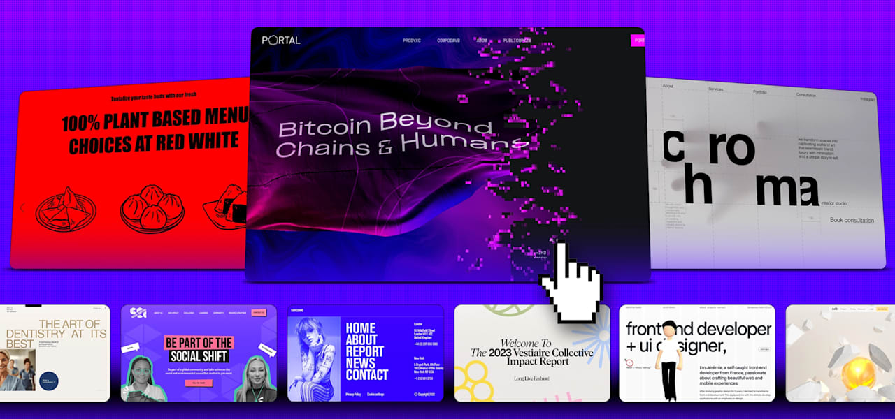
Digital glitch
Even on the rapidly advancing internet, retro never truly goes out of style. For 2024, web designers are bringing back machine glitches, reminiscent of an analogue era when technology was less polished. This trend is largely an expansion on last year’s 90s website revival, where designers embraced the no-rules early internet. But even as 2024’s glitch trend hearkens to days-gone-by—through digital clock typefaces, cyberpunk neons and VHS screen tears—it also looks forward to the future, making it especially popular with AI, cryptocurrency and other software brands.

Glitch effects incorporated into a sophisticated, brooding design, by Qream via Dribbble

Digital glitch effects in action, by One Week Wonders via Dribbble

Website design with digital glitch effects by Muhammad Abdul Rauf via Dribbble
This futurism has much to do with the impressive tech that goes into glitch design—the website is expertly animated to appear to be breaking. There is also a post-design ethos to this approach, rejecting the grid-based order for websites that are not afraid to get messy. While a trend involving the breakdown of technology could easily turn dystopian, there’s a comfort in websites that embrace destruction and find beauty in flaws.


A tech brand goes hand-in-hand with a digital glitch effect aesthetic, via Portal

Website design with digital glitch effects for a technology conference, via Awwwards
Pastel palettes
Pastel palettes offer a pleasant and colorful contrast to the moody dark mode that has been on-trend the past few years. While dark mode exploded in popularity for the way it reduces eye-strain, pastels have the added benefit of being emotionally uplifting in addition to visually soft.

Pastel colors in web design, by Näveeß on 99designs by Vista

A wellness brand’s take on the use of pastels, by LOVELY GRIT CREATIVE on 99designs by Vista

A pastel palette color scheme for a fashion brand, by Pauline • on 99designs by Vista

Pastel palettes brighten up data reports and research, via Vestiaire Collective on 99designs by Vista

Cosmetics brand emphasize the gentleness and softness of their products, using a pastel palette. By Yuliia Mykhailova via Behance

Pastels for a CBD brand, by Xperia on 99designs by Vista
Footers feature
When it comes to web design trends, designers typically focus on the more attention-grabbing site elements, such as the header, the product display or the call to action (CTA). But for 2024, designers are sprucing up an oft-neglected, unsung player on the page: the footer.

A creative studio’s innovative use of footers in web design, via La Boucle

A featured footer communicates your message louder. By Lena.P.94 on 99designs by Vista
Most of us have seen hundreds of footers without really seeing them. Because they largely display practical info, like legal disclaimers and links to lower priority pages, the design is purely functional, a neutral background color and neat columns of small text. Now designers are blowing up the footer, giving it brighter colors, peppering in illustrations and animation.

Editorial featured footer, by Robbert Schefman via Dribbble

Draw attention and give personality with a featured footer. By Ana Moreno via Dribbble
This trend works best for off-kilt brands that already have a creative, scrapbook approach to their website design. It recognizes the utility of the space for extra branding touches or for emphasizing social media links, which is great for smaller, newer businesses trying to establish themselves and their personalities with audiences. All in all, it’s one of the most joyful web design trends this year that reminds us even lesser players can and should inspire delight.

Technology brand show off innovative artsy side with a featured footer. By Robbin Cenijn via Dribbble
Featured footer for beautiful wellness brand’s site, via ToyJoy
Custom cursors
Scrolling, hovering and clicking are common interactions web designers creatively reinterpret every year. But one element always manages to stay the same: the cursor itself. For 2024, that boring old pointer is finally getting the attention it deserves through gimmicks reminiscent of the 90s internet era.

Captivating cursor design. By Alona Kor via Dribbble

The custom cursor trend can range from entirely reshaped pointers, where the familiar mouse arrow is replaced by a new graphic, or what you might call an extreme hover animation, where every subtle movement of the mouse leaves its mark on the page. Both approaches can also be combined, as in The Sight example. Here, the cursor creates a ripple effect with every movement, and it transforms into a circle labeled “Discover” when hovered over key sections.

A food brand’s take on custom cursors via Parfaite Kuisson
Quirky custom cursor design, via Jérémie Nallet
Custom cursors are not new to the WWW. However this year, the custom cursor will take on a new form, where we’ll be seeing more and more visuals and elements following the cursor itself. This is a great way for brands to add their personality to their website, while giving their visitors a playful and fun way to explore.
Adi Huri, Creative Product Manager of Visual Innovation at Wix
As with any interactive trend, this technique increases the visitor’s connection with the page through a subtle back-and-forth engagement. For that reason, it’s especially useful for landing pages, holding a visitor’s attention all the way to the CTA. This is the spot where you can feature key products, subscriptions or social media channels, etc. So enjoy more clickthroughs and sales by using this trend wisely with innovative digital marketing.

Custom cursors help users to navigate site design. By kffein via Dribbble

Arty red blob custom cursor. By Outer Studio via Dribbble
Maxed-out menus
Last year, the rising popularity of typographical websites culminated with the abandonment of imagery altogether. We might have expected such designs couldn’t get more extremely minimalist, but more and more brands are choosing to reduce the entire homepage to a navigation menu.

Playfully minimalist menu designs. By Yevhen Genome on 99designs by Vista

Maxed-out menus taking users on a journey. By Tony DeAngelo via Dribbble
We’ve recently seen menus evolve from being a purely-functional and conservative element that appears at the top of a webpage to being a bolder and more creative part of a website. Today, we see website menus that are laid out vertically, and that are animated, attracting more attention than they have traditionally. This helps to encourage visitors to explore other pages of a site.
Adi Huri, Creative Product Manager of Visual Innovation at Wix

Make a statement with a maxed out menu, via Prodesi Domesi
A bold style that gets right to the point, this trend often eliminates supporting copy, color and even scrolling. In their place is a Maxed-out menu with huge typographical navigation links. This extreme take on ‘less is more’ depends on the content being self-explanatory or previously known. A popular use-case is for portfolios and personal sites, where the visitor has come with a purpose—to research a prospective employee. In this way, the trend functions like an interactive, digital business card. Whatever their use, maxed-out menus are not just an opportunity to display beautiful typography—they respect the visitor’s time through barebones efficiency.

Extending brand personality with impactful menu design, via Alphamark

Menus don’t have to be a side dish of site design. Via Sundown Studio

Colorful maxed-out menu takes centre stage. By Zef Cherry-Kynaston via Dribbble

A maxed-out menu with a minimalist aesthetic. By Gil via Dribbble
Monochrome
In everyday life, monochrome is synonymous with monotony. But in design, monochrome is a daring risk. As with any minimalist style, fewer elements means less room for error in design choice. When done well, a monochromatic color scheme minimizes distractions while maximizing color impact.

Monochrome color scheme, by Yevhen Genome on 99designs by Vista

Tech-themed monochrome color scheme, by Simplest!!! on 99designs by Vista
We’re familiar with black and white monochromatic minimalism in websites, but we’ll start seeing this less-is-more trend encompassed with colors. By removing noisy layers of design and focusing on cleaner bold designs with a monochromatic color palette, visitors can hone in on the essence of the content.
Adi Huri, Creative Product Manager of Visual Innovation at Wix

Blue-based monochrome color scheme. By ui.izzy on 99designs by Vista

Monochrome pairing with a difference. By kharm on 99designs by Vista
Monochrome styles are becoming more popular for brands with sites that are either text heavy or want to emphasize key branding messages. Much more than simple grayscale, 2024’s monochromes range from calming neutrals to energetic colors like red. The point is to achieve high contrast, making the foreground message stand out. While not the most technologically impressive trend, monochrome is a handy technique for brands on budget, where the simple pairing of a bold color and tasteful typography can make any website come alive.

Soft monochrome color scheme. By Pirgo on 99designs by Vista
Warm, tonal monochrome. By M.A Creatives on 99designs by Vista

Spirituality brand leveraging monochrome hues. By Alexandra G Mocanu on 99designs by Vista
Bold and brash monochrome site design. By Mica Porto on 99designs by Vista
Creative grid
Love it or hate it, the grid—the structure that organizes the layout of the page into rows and columns—is a standard tool of web design. Whether designers are sticking to the grid through a symmetrical layout or challenging it through asymmetry, the grid is always invisible. But the designers and brands of 2024 are both embracing and shaking up the grid by laying it bare.

Impactful creative grid, by Vladyslav Bielik via Behance
A creative grid for NFT brand, by Yuliia Ivanova via Behance
These creative grids sometimes include literal guidelines, delineating the rows and columns. In other cases, blocks of text and graphics are stacked together like bricks in a wall. By both displaying the grid and cleverly reshaping it, this trend makes the vocal case that structure and creativity are not mutually exclusive.

Asymmetric creative grid brings fresh aesthetic to sports brands site. By Max Hopmans via Dribbble

Innovative creative grid, via All Creative
Asymmetric spacing
In our visually saturated culture, minimalism can make a bold statement. But after years of minimalist approaches to interface design, even stark bareness can lose its power to impress. Over the years, we’ve seen designers mix up minimalism through even starker trends like brutalism. But for 2024, minimalism is getting a new look through one the most subtle design elements: space.

Give a modern edge to your brand’s site with asymmetric spacing. By Yana Smoliankina via Behance
Typography has made much creative progress over the years, and we’re now seeing uses of different fonts complementing one another within the same sentence. This year, the thoughtful use of asymmetric spacing will play a role in the composition of typography. But it won’t only impact typography— it will influence the entire layout of a webpage, displaying brutalism at its finest!
Adi Huri, Creative Product Manager of Visual Innovation at Wix

Asymmetry adding intrigue to web design content. By Ben Johnson via Dribbble
Without adding another unnecessary object to the page, asymmetrical spatial relationships revitalize common layouts through sheer positioning, even adding space within words themselves. 2024’s Asymmetric spacing trend creates a sense of lightness, the feeling that elements are floating on the page. This airy effect can be useful for sites, like healthcare brands, that want to cultivate serenity through a style that is decidedly more grown up than the Pastel palettes trend. It combines the best aspects of minimalism—modernity, approachability, efficiency and confidence—with a touch of the unexpected.

Minimalist fashion brand is a fit with asymmetric spacing. By Mulikat Abdulrahman via Dribbble

Incredibly interactive asymmetric web design, via Herve Baillargeon

Inspiring, creative asymmetric spacing, via The Method

Furniture brand use asymmetric spacing for multiple product displays. By Alex via Dribbble
Ready for the 2024 web design trends?
Each of these nine web design trends represents a complex relationship with new technology. And if you’re a small business planning to refresh your digital presence this year, they’re certainly a brilliant place to start.
On the one hand, trends like cinematic scrolling, digital glitch and custom cursors leverage impressive animations that keep the magic of the internet alive. Conversely, trends like asymmetric spacing, monochrome and creative grids use simple techniques and effective design choices to showcase the human talent behind the machine. Maxed-out menus and footer features bring lesser treated page areas up-to-date. And through it all, pastel palettes combat dystopia with color and warmth. Wherever artificial intelligence will ultimately take us, one thing is certain: 2024 will be a year as diverse for web design trends as the internet itself.
Ready to take these trends online?
Build your unique online presence with Vista x Wix.
