Postcards have come a long way and not just in a geographical sense. What began as novelty travel souvenirs has evolved into a form of creative expression for artists and businesses alike. But the purpose of postcards has always been to communicate a message, making a well-chosen postcard font invaluable.
From decorative lettering and elegant cursive to retro throwbacks and digital newcomers, there are many ways fonts can express themselves on the canvas of a postcard. But that is exactly what makes choosing the best postcard font such a challenge. To simplify the process, we’re going to explain the basics of how to choose a font for your postcard, showcasing over 50 postcard fonts you can use on your next custom postcard design.
Find and choose the perfect postcard font
How to choose a postcard font in 7 steps
Choosing a font for your postcard is both a creative and practical exercise. To pick the best postcard font, you have to have a clear objective, knowledge of typographic principles, budget and creative vision. Here are the fundamental steps to choosing fonts for a postcard.
Step 1: Outline the purpose of your postcard
There are countless reasons and ways to use a postcard. The most traditional is for promotional or correspondence purposes by mail. Businesses might use postcards to announce a product launch or special offer, market an event or thank customers for their loyalty, as informational inserts for shopping bags or packaging boxes. On its own, an illustrative postcard makes for simple merchandise. Consider how your postcard will be used and what its content should accomplish, whether for education, persuasion, inspiration or collectability.
Step 2: Establish your brand identity
A brand voice, personality and overall brand identity guide all of a business’ design decisions. If you have not already, develop visual brand assets, especially a logo and brand typeface, both of which will steer your postcard font. For independent creatives, a brand is essentially your personal style, what sets your creative voice apart from other artists.

Source: Illustration by yokunen via 99designs by Vista
Step 3: Get familiar with font terminology
To shop for fonts effectively, you’ll need to know the basic typographic terms and principles font foundries (the companies who license fonts) use. Not only does this give you the language needed to search for a particular style, but each of the different font types have specific ways they are conventionally used.
Step 4: Research how fonts communicate
Like everything in design, fonts communicate visually beyond the obvious. Partly through historical uses and partly through shape language, each typeface carries nonverbal associations readers intuitively absorb and interpret. Understand font psychology better to ensure your postcard fonts are sending the right message.
Step 5: Catalog how many fonts your project will need
Depending on your postcard content, you may need to choose one or multiple fonts. For simpler postcards, a single display font for a large headline accompanying an image will suffice. Others may need to balance minor text for informational content like sales copy, promotional descriptions and contact details.
Given the limited canvas space, we recommend no more than two fonts for a postcard design. Keep in mind that you can reuse one font in multiple styles (such as bold, narrow, italic or condensed) to give the illusion of several fonts without breaking visual consistency. Combining fonts, however, comes down to the design principle of contrast—that is, pairing two different types of fonts (like a sans serif and script) to emphasize how they compliment each other.

Source: Illustrated postcard design by EDSTER via 99designs by Vista
Step 6: Establish a budget
Designing your postcard in professional software will also require a licensing fee which can cost a few hundred dollars, but a postcard template builder provides a much lower cost solution. While working with a graphic designer will also involve negotiating additional fees, your fonts will be chosen by an expert.
Tip
Even if a font is free, make sure to review the license for any restrictions. Many “free” fonts are only free for personal (non-commercial) use.
Step 7: Find postcard inspiration
You may have seen many postcards over the years, but chances are you haven’t paid much attention to their typography design. Take all of the knowledge you’ve gained so far and research current font trends and postcard inspiration to get an idea of professional lettering styles.
50 examples of the best postcard fonts
- Business fonts for promotional postcards
- Calligraphic fonts for elegant postcards
- Versatile fonts for illustrated postcards
- Hand-lettered fonts for creative postcards
- Retro fonts for nostalgic postcards
Business fonts for promotional postcards
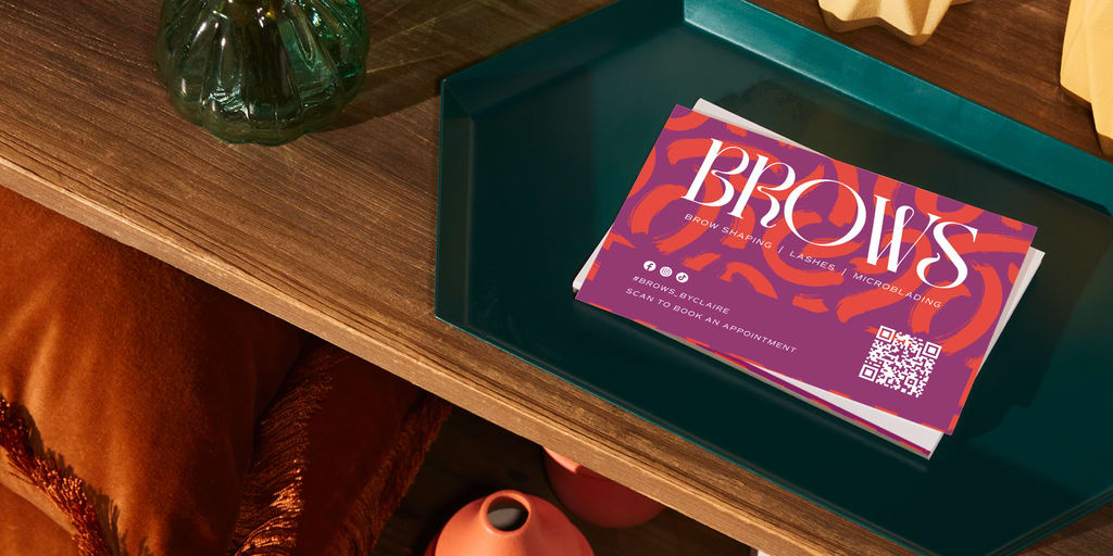
A promotional postcard is often used to advertise new products, announce discounts or promote general business advertising. The aim is to draw attention with display font headlines and persuade purchases with informative advertisement copy. While a clean geometric sans serif like Open Sans or Chopin is adaptable to most professional contexts, businesses can get more creative with their promotional postcard fonts using their brand identity.

Source: Promotional postcard design by Kosmos Creatives via 99designs by Vista
A classy serif like Sinete, for example, evokes upscale products and tastemaker brands. Gopher has a playful lettering style in thicker variations that pair well with trendy apparel or restaurant brands. An angular sans serif like TT Supermolot Neue comes across as futuristic and useful for tech brands.
Calligraphic fonts for elegant postcards
For a postcard that conveys a sense of luxury and taste for wedding announcements or formal event invitations, you can’t go wrong with an elegant script or a tall serif. Glow Roses, a serif font with curled letters and stylish ligature connections, gives the best of both worlds. Script font Holy River contains multiple varieties of cursive swirls for each letter, allowing for interchangeable ornamental flourishes that give the illusion of custom calligraphy.

Source: Thank-you card design by Jappybe via 99designs by Vista
Autica Monthgel Monoline Script Sans goes even further with a built-in font pairing of two complementary typefaces: a narrow sans serif and a signature-style script. Elegant fonts on postcards make for the best formal invitations and communications from high-end retail, artisanal craft and gourmet delicacy brands.
- Glow Roses
- Holy River
- Autica Monthgel Monoline Script Sans
- Catchy Mager
- Madelyn
- Quelia
- Blue Cashew
- Dodgeland
- Holy Mary
- Rosmerta
Versatile fonts for illustrated postcards
Collectors once valued postcards for their characteristic imagery, so it’s no wonder illustrative postcards remain one of the most popular types for artist merchandise, gift store souvenirs or creative business promotions. Fonts that accompany illustrations are not looking to steal the show but rather reinforce the overall style. Postcard designers often accomplish this with minimalist fonts that echo the line art. Consider how the rounded sans serif on the design below reflects the illustration’s curved lines.

Source: Illustrated postcard design by Luz Viera Studio via 99designs by Vista
Specific font types can cater to specific aesthetics, like the storybook feel of Volkorn or the pixel art in TT New Pixel. Other fonts can match the creative energy of the illustration with unexpected quirks in their letter design, like the shape-changing variance in Transforma. Letterpress Sans, meanwhile, has a subtle hand-drawn style that can sit comfortably in the background of any illustration.
- Volkorn
- Letterpress Sans
- Transforma
- TT New Pixel
- Radio Disney
- FF Cocon
- Flux Architect
- Brizel
- Blogger
- Fester
Hand-lettered fonts for creative postcards
While many artists design unique hand-lettering for postcards, decorative fonts come close to custom typography for postcards that incorporate inspirational quotes, creative business slogans or personal monograms. The font Price Check mimics the hand-painted techniques traditionally used for promotional materials. Other fonts embrace digital techniques to reach new creative heights, like Embroidered’s photorealistic stitching.

Source: Creative postcard design by ViktoriiaN via 99designs by Vista
Because the look of these fonts can vary so drastically, your choice will depend on the aesthetic of your postcard—whether you’re going for the DIY effect of the Cutout or the ambiguous shapes of Tanga, for example. All in all, decorative fonts give character to the design, reinforcing the personalized nature of postcards.
- Price Check
- Embroidered
- Cutout
- Tanga
- Cekoria
- MN Atline
- Tropic
- Walnut
- Klayfish
- Smoky Burger
- MN Niraloka
Retro fonts for nostalgic postcards
Although postcards remain a popular print product, they are an old-fashioned method of communication. Embrace that nostalgia for the good old days of handwritten correspondence with a retro postcard font.

Source: Vintage postcard design by gromovnik via 99designs by Vista
There is a huge selection of bygone eras to choose from, whether the 80s fashion magazine serif font Denton, the feel-good 70s bubble serifs of Plush, the 50s signage lettering of Frontage or the 20s decadence of Luks Deco. For those looking to evoke vintage postcards more literally, Postmark is modeled after traditional postal service typography.
- Postmark
- Denton
- Plush
- Frontage
- Luks Deco
- Sunday Morning
- Saucy Ketchup
- Subface
- Panel Mono
- Birchside
- Centralismo
Choose the best fonts for your custom postcard
Postcards are pocket-size canvases for creative imagery, and a well-chosen font draws attention to its message while conveying personality and tone. To find the best font for your postcard, consider its intended impact on the reader, research font styles that match this impression and try out options that pair well with your other imagery.
