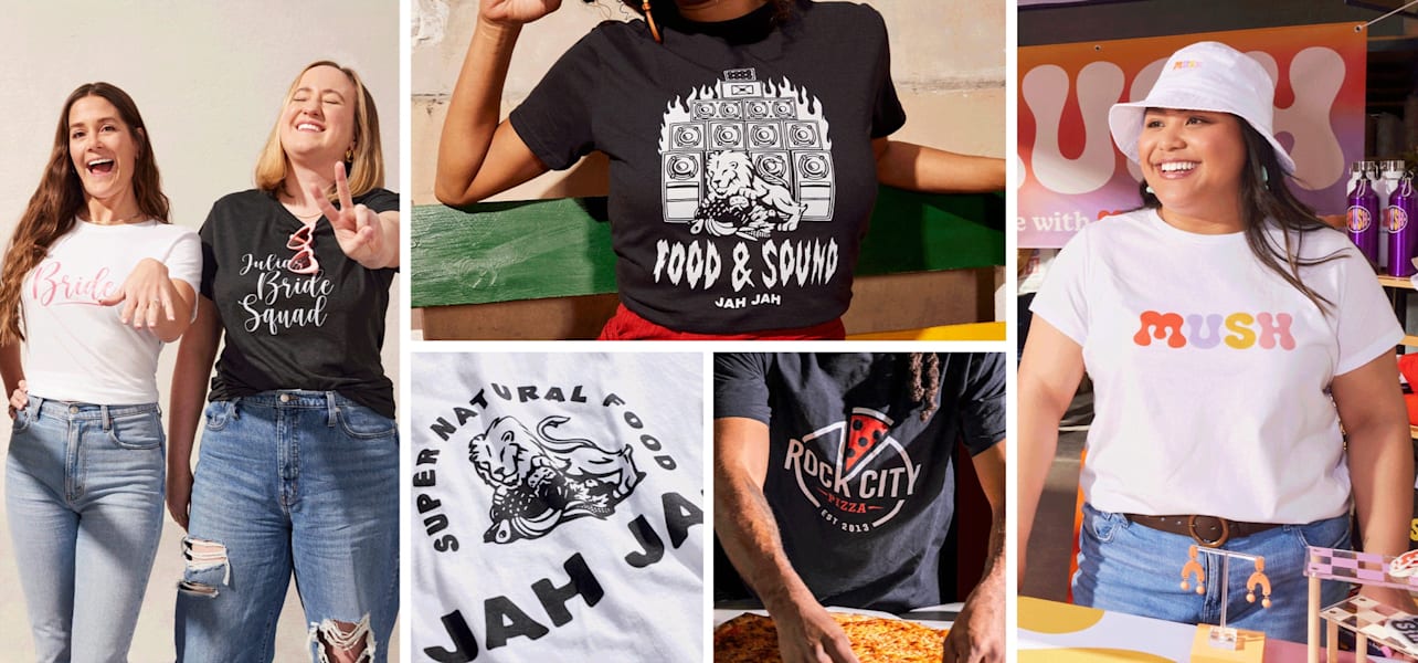
Creating custom merchandise is one of the most effective ways for small business owners to build brand awareness and turn loyal customers into walking billboards for their brand. But designing for apparel brings a unique challenge: finding a font that looks crisp, sharp and perfectly balanced when printed.
Most look great when viewed on a glowing digital monitor, but many fonts for T-shirts – especially more complex designs – can completely fail when printed on an absorbing, textured fabric weave.
To bridge the gap between digital design and physical reality, you need an intentional, production-ready strategy. This font and typography guide for t-shirt design will help you navigate the transition from screen to textile, so your message is highly legible, visually striking and ready for production.
- Choose fonts that suit your printing method, whether you’re using screen printing or Direct-to-Garment (DTG) printing.
- Keep fabric color and ink coverage in mind, especially when printing light designs on dark T-shirts.
- Limit your design to one or two complementary fonts so your message stays clear and easy to read.
- Use standard placement guides for left-chest designs, full-front graphics, back prints and sleeves.
- Avoid ultra-thin fonts, de

Essential rules for apparel legibility and print production
When choosing fonts for custom T-shirt designs, think beyond how they look on screen. Your typography also needs to suit your brand, your printing method and the fabric you’re printing on. Balancing technical limits with your brand identity will mean your design stands out clearly on any garment.
If you’re still developing your overall concept, it can help to understand what makes a good T-shirt design before choosing your final font.
Physical print thresholds (screen printing vs. DTG)
Choosing the wrong typeface can ruin an otherwise brilliant piece of merchandise. This is especially important if you’re learning how to start a T-shirt printing business, where every design needs to work both creatively and commercially.
Direct-to-garment (DTG) printing works much like a digital inkjet printer, making it exceptional at handling fine details, subtle gradients and complex textures. In contrast, traditional screen printing forces thick plastisol ink through a mesh stencil, meaning that slightly thicker lines and wider spacing are needed to maintain the structural clarity of the font.
When designing for screen printing, avoid ultra-thin script swashes or hairline serifs. These delicate lines can snap, lift or completely disappear during the production process. Similarly, heavy ink can expand into the tight gaps of letters, causing them to bleed and fill in. So watch out for overly dense display counters – the negative spaces inside characters like O, B, A and e – which can become unreadable under the pressure of screen printing.

Context, intent, and brand alignment
Every piece of custom apparel represents your business out in the wild. This means your choice of graphic tee fonts should reflect your overarching brand identity, especially when creating T-shirts for a business. Typography is not just a decorative design choice. Your brand’s signature font can be a silent communicator of your brand’s values, professionalism and industry positioning.
Before finalizing your layout, consult your internal brand style guide to make sure your T-shirt designs are visually consistent across all your marketing touchpoints. For example, bold, structured lettering works well for a rugged, outdoor adventure brand, while a high-end boutique might choose elegant, clean fonts. Matching the typeface’s structural properties with your brand’s purpose keeps your visual messaging unified and professional.
For more general inspiration, you can also explore these T-shirt design trends and tips.
The 5 major t-shirt font categories (and how they print)
Typefaces fall into five fundamental design categories that each have distinct psychological meanings and physical printing characteristics. Selecting the best fonts for T-shirts comes down to balancing your aesthetic goals with the various limitations of textile printing. The right typography can also depend on the blank garment itself, so it’s worth comparing the best T-shirt brands before finalizing your design.
Traditional fonts (serif)
Serif fonts are defined by the small decorative feet or strokes at the ends of their character lines. They project a feeling of heritage, authority and professionalism and are an excellent fit for traditional businesses, law firms, upscale cafes or academic styling.
When printing with fine serif tails, use a high color contrast and premium ink application to keep them legible on heavily textured fabrics like heavy cotton or canvas. If the contrast is too low, the text will blur into the background.
Modern fonts (sans-serif)
Sans-serif fonts are clean, accessible and highly legible. The structure of the letters lacks the feet of serif fonts. If you are thinking, “Should I use serif or sans-serif fonts for T-shirt text?” then sans-serif is the undisputed baseline choice – especially if your design includes long secondary messaging, small text blocks or sub-headlines. Their consistent line weights mean the letters stay stable during ink curing, making them highly reliable across all garment materials.
Script and handwriting fonts
Script fonts are ideal for weddings, special events or premium boutique merchandise. They emulate fluid calligraphy or personal handwriting, but because these characters tend to connect or overlap, this can present a print risk.
Designers should proactively increase tracking (the uniform spacing between a group of letters) if the script characters are overly intricate. This will mean that fine strokes don’t blur into an unreadable mass when the ink cures on the fabric.
Playful fonts
Playful fonts inject a sense of fun, approachability and casual energy with their thick, energetic and rounded letterforms. Structurally, their bold lines and generous counters are broad enough to tolerate ink expansion when printed on fabric. This makes them especially well-suited for high-vibrancy, multi-color screen prints targeted at younger demographics or community-focused casual events.
Decorative and display fonts
Decorative and display fonts are designed to stand out, making them a strong choice for bold slogans, event T-shirts, merch drops and branded T-shirt ideas. Their distinctive shapes can add personality and visual impact, but they work best when used sparingly. For printed apparel, choose display fonts with clear letterforms, enough spacing and solid stroke weights so the design stays readable on fabric.
Advanced composition: Layout formulas, scaling and contrast
Professional T-shirt lettering design relies on mathematical proportion, considered font pairing and strict color contrast rules. Understanding these three elements of font printing will ensure your custom typography transitions perfectly from a flat digital file to a garment that moves, creases and will be viewed in different lighting settings.
Proportional layout and white-space boundaries
To avoid a messy, amateur layout, your design should adhere to standardized placement grids. If you want more detail on scale, spacing and positioning, this guide to T-shirt design proportions is a useful next step.
Use the table below to find the ideal placement for your text on a garment, and remember to always build generous white-space buffers around your typography. Leaving adequate breathing room will mean that your text doesn’t feel suffocated by surrounding graphics or the natural folds of the fabric.
| Placement location | Standard dimensions | Placement guide |
| Left-chest hits | 3.5 to 4 inches wide | Center over the pocket area. This placement is ideal for logos, initials or small brand marks. |
| Full-front displays | 10 to 12 inches wide | Place around 2 inches below the collar line so the design sits naturally on the chest. |
| Vertical sleeve runs | Varies by font weight and sleeve length | Align the text so it flows naturally down the arm and remains readable when worn. |
Foolproof font pairing formulas
Creating a balanced layout calls for a strict approach to font pairing for T-shirts. When planning your design, a key question to consider is: how many fonts should you use in a T-shirt design? The golden rule is to restrict your design to a maximum of two fonts, as using three or more creates visual chaos and can dilute your message.
For a clear and easy-to-read composition that prints beautifully, pair a high-impact decorative or serif header with a clean, understated sans-serif secondary tagline. This creates an instant dynamic hierarchy, drawing the eye to your primary brand statement while keeping secondary details perfectly legible.
Custom image displaying this idea:
[ High-Impact Decorative / Serif Header ]
( Breathing Room )
[ Understated Sans-Serif Secondary Tagline ]
Color contrast protocols and fabric absorption
A common mistake made in custom t-shirt typography is ignoring how ink interacts with colored fabric. If you want to make sure your font choice stands out on a T-shirt, then you need to implement high-contrast color rules: light text belongs on dark fabric, and dark text belongs on light fabric.
Keep in mind that dark garments need a structural “underbase” layer of white ink before your primary design colors are applied. This necessary base can slightly thicken fine line weights, meaning delicate text details might shift during printing. Always check how your selected ink colors interact with various garment blends – for example, 100% cotton absorbs ink differently than a poly-blend – to maximize contrast and keep your typography sharp.
If you’re still choosing your base garment, this guide to the best T-shirt colors can help you pick a shade that supports your typography.
Graphic tee fonts: From design to reality
Creating a professional custom T-shirt doesn’t require a master’s degree in graphic design, but it does require moving beyond pure digital guesswork. If you’re building a fuller apparel range, you may also want to explore the different types of T-shirts before choosing your final format.
By respecting print thresholds, choosing the right category and keeping the layout clean and balanced, your apparel will look professional enough to act as a premium extension of your brand.
You don’t have to navigate these rules alone. VistaPrint offers the intuitive design tools, professional understanding and expert advice you need to bring your creative ideas to life with confidence.
FAQs: Font and typography for T-shirt design
Which fonts should I avoid to prevent printing issues?
You should avoid ultra-thin script fonts, fonts with hairline serifs and fonts with overly dense display counters (small internal spaces in letters like “e” or “O”). These delicate details can disappear or bleed into solid blocks when printed on fabric meshes.
Should I use serif or sans-serif fonts for T-shirt text?
Use sans-serif fonts if you have small text, secondary taglines or paragraphs, as their consistent geometric line weights retain high legibility in print. Use serif fonts primarily for larger headlines where you want to project tradition, heritage or professionalism.
What is the best text size for a custom T-shirt?
The best size depends on placement. A full-front design should be 10 to 12 inches wide and placed 2 inches below the collar. A left-chest hit should be 3.5 to 4 inches wide. Adjust your font size to fit these physical grid boundaries.
How many fonts should you use in a T-shirt design?
You should use a maximum of two fonts in a single T-shirt design. Restricting your palette to two typefaces establishes a clean dynamic hierarchy and prevents visual clutter.
How can I make sure my font choice stands out on a T-shirt?
Enforce strict high-contrast color schemes (light ink on dark shirts, or dark ink on light shirts) and account for the white underbase required on dark garments. Additionally, ensure you select a font weight that matches the structural limits of your printing method (DTG vs. screen printing).

