Color theory can play an important role in your small business branding. Colors carry meaning, and the colors you choose for your business can have an impact on brand recognition and perception.
To better understand this, Reboot, an SEO marketing agency, created logos for five fictitious companies and showed them to their study participants. After giving them 10 minutes to study the logos, 78% were able to recall the primary color of the logo, compared to only 43% who were able to remember the company name.
Learning how to choose your brand colors (and mix and match different hues) gives you the confidence and know-how to build a memorable identity. Here, we’ll go over everything you need to know about picking the right colors for your small business.
- Rediscover the color theory wheel.
- Understand warm and cool brand colors.
- Combine colors that work for your brand.
- Look for inspiration.
- Put it all together.
1. Rediscover the color theory wheel.
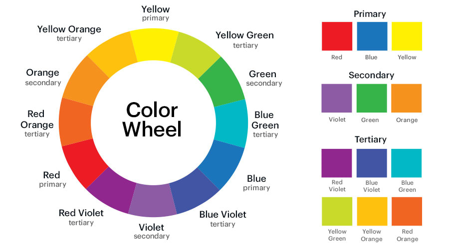
To kick off this color theory refresher, let’s start with an art class classic (you might’ve even covered it in science class!). Also known as the color wheel, this is your cheat sheet on how to pick brand colors that work well together.
Sir Isaac Newton developed the first circular diagram in 1666 as part of his research into the behavior of light. Using a lamp, Newton ran white light through an optical prism to separate it into a rainbow of colors. Scientists had seen the light-through-glass trick before but assumed the lens somehow colored the light. By reflecting the colored beams into another glass crystal, Newton reformed them back into white light. This experiment, for the first time, proved that colors were a characteristic of the light itself.
Newton’s 12-color wheel consists of:
- 3 primary colors (red, yellow, blue)
- 3 secondary colors (created when you mix primary colors: green, orange, purple)
- 6 tertiary colors (the in-between colors made from primary and secondary colors, like blue-green or red-violet)
VistaPrint Tip
Need help creating a perfect palette for your brand? Check out VistaCreate’s color palette generator to find a color combination that looks great together.
2. Understand warm and cool brand colors.
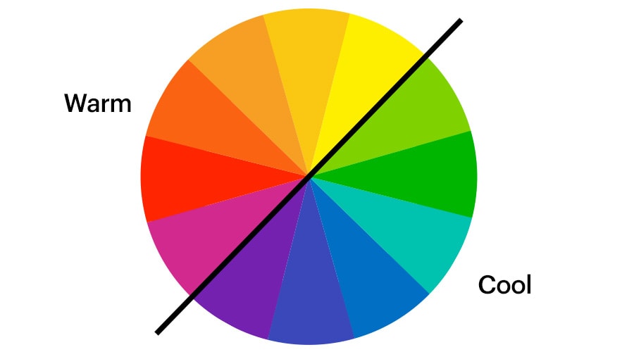
The color wheel reveals the difference between warm and cool colors. When you split the wheel in half, one side of the wheel shows warm colors: red, orange and yellow (and variations of these three colors). These colors are intense, energetic and vibrant. Warm colors like red can be used to imply passion or strength. Red also stimulates appetite and attracts attention. This active reaction is often used by brands to get people’s attention.
Are you running a flash sale to move old stock? There’s a very good reason that SALE signs often use red…it stands out. Orange is a good choice if you want to promote child-friendliness, cheerfulness and optimism. It confidently calls people to action and creates a sense of enthusiasm. Yellow is another positive color that’s often used to grab attention. Given its association with sunny weather, it’s a popular choice for businesses in the travel and tourism sector.
On the other side of the wheel are the cool colors: green, blue and violet. These are more subdued and convey a sense of calm and tranquility. People associate green with nature, environmental consciousness, and sustainability. Greens are also linked to spring and rebirth, making them a good option if you offer health, wellness or education services. Blue is generally associated with competence and trustworthiness. So, a blue color scheme or accent could be an appropriate choice for businesses as diverse as financial institutions and child or pet care. Basically, any business that needs to look reliable and secure.
3. Combine colors that work for your brand.
Your brand color palette will extend across a range of touchpoints with your business, while your logo may only include one or two colors. You’ll want to employ this palette for tools beyond your logo, like your website, storefront banners, brochures and staff uniforms.
Color formulas provide a foolproof way of using the 12-part color wheel to pick the perfect color combinations. And don’t worry -you don’t need to be an algebra expert to get your head around this equation.
Here are a few color formulas to try:
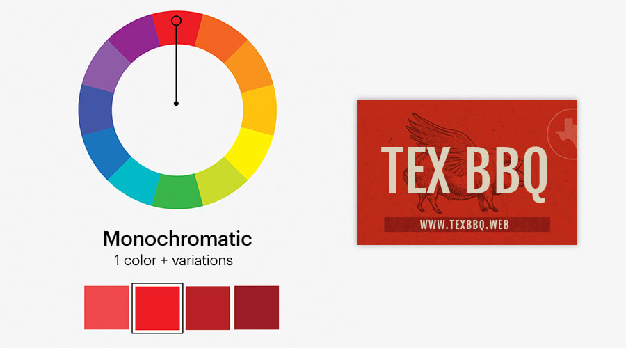
- Monochromatic. Pick one color from the color wheel and adjust the saturation and value to create variations of that color.
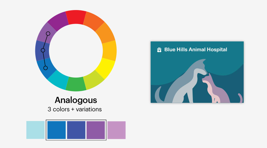
- Analogous. Choose three colors that are side by side on the color wheel as the basis of your color scheme.
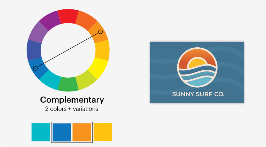
- Complementary colors. Choose two colors that are opposite each other on the color wheel. Start with the two opposite colors and then add variety by playing around with the saturation and value.
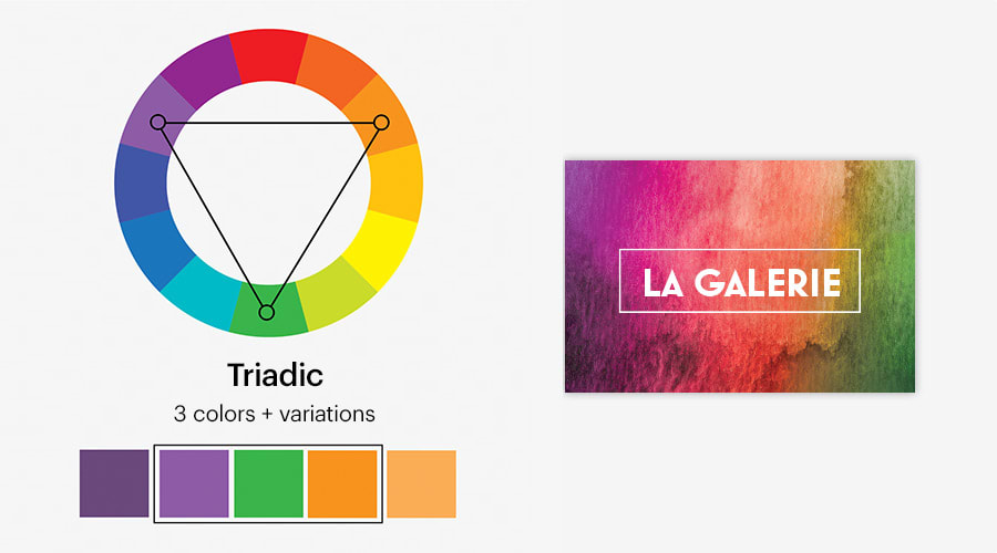
- Triadic colors. Choose three colors that are evenly spaced, forming a perfect triangle on the wheel…and then find the perfect color combination by adjusting saturation and value.
4. Look for inspiration.
Once you’ve learned the basics of color theory, use the color formulas above as a starting point for experimentation. Take inspiration from the world around you, whether in nature, food, fine art…the possibilities are endless. Try to look for inspiration in places that reflect your brand personality. For example, if you run an outdoor supply business, you might look for inspiration at a nearby campground or hiking trail. From there, choose 3-4 colors from that scene to compose your color palette and use these colors consistently across your branding.
5. Put it all together.
Now that you have a few basic techniques on how to choose your brand colors, there are a few things to consider when perfecting your palette.
- Beware of brand colors that vibrate. When you place two colors too similar in value next to each other, they can create a vibrating effect that’s harsh on the eyes and impossible to read. Instead, try adjusting the contrast of the image by toning down the saturation, hue or value.
- Avoid large areas of light text on dark backgrounds. If you need to include a large amount of text, stay away from light text on a dark background. It’s often too high in contrast and makes it hard for people to read.
- Pick neutral colors to balance the design. Be sure to make use of neutral colors like white, black, and gray. Surrounding bright colors with neutrals makes your design appear well balanced.
- Use contrast to make important info pop. Use color selectively for elements you want to stand out the most –like your logo and company name.
- Consider how your brand colors make people feel. By understanding the common associations with different colors, you can create a color scheme that elicits certain feelings, like security and trustworthiness.
- Look around you for color inspiration. Whether it’s another business you admire, an image with an attractive blend of colors or a trend you’ve spotted in fashion, you can find color inspiration anywhere.
- Refer back to the color wheel if in doubt. If you don’t feel comfortable borrowing a palette from somewhere else, use the formulas mentioned above to make sure the colors you pick work well together.
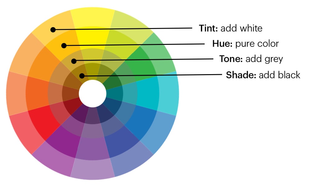
Color terminology
Tint: A color made lighter by adding white.
Shade: A color made darker by adding black.
Tone: A color that is muted by adding gray.
Hue: Another word for a color.
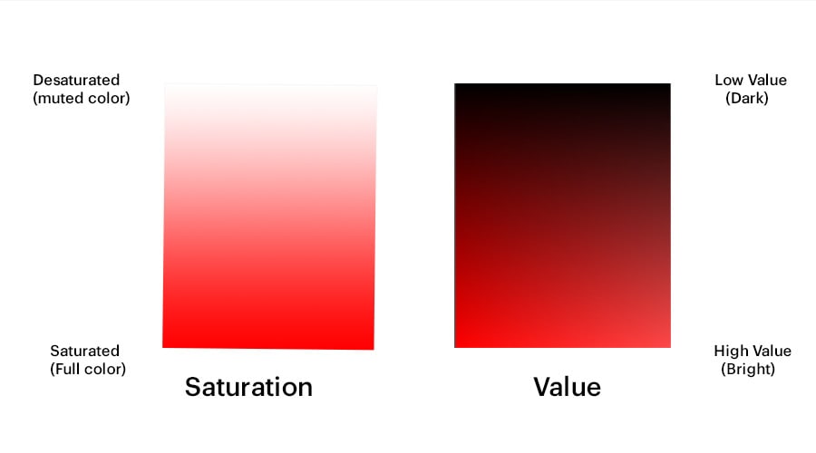
Saturation: The intensity of a color (saturated colors are brighter and more intense).
Desaturation: Colors which have less pigment and are more muted.
Value: Refers to how light or dark a color is.
Neutral colors: Black, white and gray.