Poster design ideas mean something very different today than they did even a few years ago. Audiences are exposed to more visual content than ever, their attention spans are shorter and posters are no longer limited to a single wall or window. A poster might appear in-store, on a street corner, at an event or be reshared digitally on social media within minutes.
That’s why the most effective poster design ideas in 2026 focus on clarity, speed and purpose. A poster needs to communicate quickly, look good across different channels and guide the viewer toward a clear action.
At VistaPrint, we see posters working hardest when creativity is paired with execution. The strongest ideas for posters are designed with real-world use in mind, from their layout and sizing to print quality and placement.
- Effective poster design starts with purpose. The best poster format ideas are chosen based on your goal, audience and where the poster will be seen.
- Eye-catching visuals, clear hierarchy and a focused message help posters stand out in busy physical and digital spaces.
- Different design styles suit different messages, depending on whether your style is minimalist, typographic, image-led or bold.
- Smart poster layout ideas improve readability, guide the eye and make key information easy to absorb at a glance.
- Great poster ideas should work across channels. With small adjustments, the same poster design can be effective in print, in-store and on social media.

What makes a great poster design in 2026?
The most successful poster design ideas today are built around three core pillars: attention, clarity and action. The strongest poster designs balance creativity with intent. They use style as a tool, not a distraction, so that every element earns its place.
Attention is about earning a glance from your audience. This might come from bold typography, strong contrast or a striking image, but it must work quickly. Posters are often viewed from a distance or while people are moving, so subtlety only works when it’s deliberate.
Clarity is what keeps someone looking. Once you’ve captured their attention, the message needs to be easy to understand. Clear hierarchy, logical layout and intentional spacing help viewers instantly grasp what the poster is about.
Action is what gives the design purpose. A great poster design leads the viewer somewhere, whether that’s an event, a store, a website or a moment of recognition. Aesthetics alone are no longer enough. The design must also support the outcome.
How to choose the right poster design idea
With so many ideas for posters available, the challenge is choosing the one that fits your situation best. Start by grounding your decision in three factors: goal, audience and placement. The best poster format ideas come about when these three elements align.
Your goal defines what success looks like. A promotional poster might prioritise urgency and visibility. An awareness-focused poster may aim to build recognition. Educational posters need structure and readability, while conversion-driven posters need a clear call to action.
Your audience shapes how the design should feel. Consider their age, context and mindset. A poster aimed at commuters needs instant clarity; a poster for a niche event can afford more detail. Design choices should reflect how and where people will engage with it.
Your placement influences everything from the layout to the size. Posters in-store can be more detailed than street posters. Event posters may need bold titles visible from afar. Social media adaptations benefit from high contrast and simplified layouts that are easy to read quickly.

Creative poster design ideas by category
There’s no single poster style that works for every message. Instead, cool poster design ideas tend to fall into recognizable categories that are each suited to different goals and environments. These are some of the most successful types of posters.
Minimalist poster design ideas
Minimalist posters focus on restraint. They feature fewer elements, have generous spacing, and intentional typography allows the message to stand out without distraction. The key is precision. Every color, line and word should serve a purpose.
This approach works especially well in both physical and digital spaces because it improves legibility and reduces the visual noise. Minimalist poster design ideas are often used for premium brands, exhibitions, films or events where confidence and clarity matter.
Typography-led poster design ideas
When information is central, typography becomes the hero. These poster format ideas rely on type size, weight and hierarchy to communicate clearly and creatively. But bear in mind that readability is critical. Scale, spacing, and contrast matter more than decorative fonts, as your audience won’t act if they don’t know what you’re trying to say.
Strong typographic posters guide the viewer’s eye through the content, making dates, locations and key messages easy to scan. They’re ideal for events, campaigns or brand statements where words carry the message.

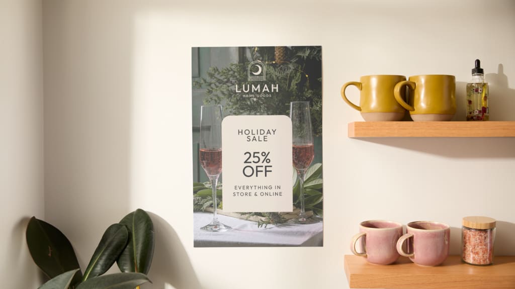
Image-driven poster design ideas
Image-led posters use photography or illustration to communicate emotion, atmosphere or story at a glance. A single strong visual can often say more than multiple lines of text. The most effective designs pair visuals with minimal, supportive text.
Photography tends to add realism and connection, while illustration offers more flexibility and abstraction. Creative poster-making ideas like these work well for films, cultural events, products or causes where emotional impact is key.

Bold colour and contrast poster ideas
Colour is one of the fastest ways to attract attention. Bold colour poster design ideas use contrast and palette choices to stand out in crowded environments.
High-impact colour works particularly well for promotions, retail signage and events where competition for attention is high. The key is intention. Too many colors can overwhelm the design, while a limited but bold palette strengthens your brand recognition. The colours you choose should support readability, not compete with it.
Vintage and retro-inspired poster ideas
Vintage-inspired posters tap into nostalgia while still feeling contemporary. Retro typography, muted colour palettes and classic layouts can create warmth and familiarity.
These poster design ideas perform well for hospitality, music, cultural events and brands that want to evoke a feeling of heritage or craftsmanship. The challenge is balance, as modernising retro elements should mean that the design feels intentional rather than outdated.
Interactive and hybrid poster design ideas
Interactive posters extend beyond the page, and often feature elements like QR codes, short links and digital prompts. These turn your posters into gateways to new touchpoints where you can connect with your audience.
Hybrid poster design ideas are especially effective for events, retail and campaigns that want to connect physical spaces with digital experiences. The design should make the interaction obvious and easy, with clear prompts and visual cues. When done well, this kind of interaction enhances engagement without cluttering the layout of your poster design.
Poster layout ideas that improve readability
Poster layout ideas are often the difference between a design that works and one that gets ignored. The layout you choose determines how information flows and how quickly it can be understood. In many cases, layout matters more than style, and even the most creative poster design idea can fail if the layout is confusing or cluttered.
Stick to these rules:
- Strong visual hierarchy means that the most important message appears first.
- Spacing and balance prevent overcrowding and improve legibility.
- Clear focal points guide the viewer’s eye naturally through the design.
Check out our guide to the best poster templates for more inspiration.

Poster sizes, specs and design considerations
Choosing the right size for your poster is both a technical and a strategic decision, as different poster sizes suit different environments and viewing distances. Understanding how size impacts the layout helps ensure that your poster design ideas will translate smoothly from screen to print. Planning ahead also makes it easier to reuse your designs across different formats.
Larger formats are ideal when you need good visibility from afar, while smaller posters work well in close-up settings. The resolution, bleed and margins of your design all affect the print quality, so your designs should be prepared with the final size in mind.
Print vs. digital poster design: What actually changes
One of the biggest advantages of modern poster design ideas is their adaptability. A single concept can work across print and digital channels with a few smart adjustments.
For print, readability at a distance is the most important factor. Your fonts should be clear, your colors consistent and the resolution high. For digital posters, contrast and simplicity become even more important, especially when they’re likely to be viewed on small screens.
Digital posters can also include interactivity, while printed posters should rely on visual cues. For example, calls to action may shift from URLs to QR codes. Understanding these differences will allow you to design once and deploy your poster everywhere.
Ideation to finished poster checklist
Turning ideas for posters into finished designs doesn’t need to be complicated. A simple process keeps your creativity focused and practical, and should prevent the need to rework your design.
Just follow this step-by-step guide:
- Choose a poster design idea that matches your goal.
- Select a layout and size that suits the poster’s intended placement.
- Adapt for various placements (for example, print vs. digital).
- Refine the visual hierarchy and calls to action.
- Prepare your files correctly for printing and sharing.
Once you’re happy with your design, check out our guide on how to make a poster to ensure you’re ready to go to print.
Common poster design mistakes businesses make
Many posters fail not because of bad ideas, but because of avoidable mistakes. Avoiding these pitfalls helps poster design ideas perform as intended:
- Overcrowding content makes posters hard to scan.
- Weak or missing calls to action leave viewers unsure what to do next.
- Designing without considering placement can reduce the impact.
- Ignoring how readable the poster is at a distance often undermines otherwise strong designs.
Turning ideas for posters into impactful designs
Cool poster design ideas are only valuable when they’re executed well. When creativity is supported by clear layout, smart sizing and thoughtful placement, your posters become powerful communication tools.
Don’t be afraid to experiment, but ground all of your decisions in best practices. And remember that the most effective posters balance confidence with clarity, and creativity with purpose.
FAQs on poster design ideas
What makes a poster design stand out in a crowded space?
Strong contrast, clear hierarchy and a focused message help posters stand out. Designs that communicate quickly and avoid clutter are easier for audiences to notice and remember.
How do I choose the right poster design idea for my audience?
Start with your audience’s context. Consider where they’ll see the poster, how much time they have to look at it and what action you want them to take. Let those factors guide your design choices.
What poster layout works best for print versus digital use?
Print posters benefit from larger text and clear spacing for clearer viewing at a distance. Digital posters work best with simplified layouts, strong contrast and minimal detail for smaller screens.
How many design elements should a creative poster include?
Using fewer elements usually improves clarity. Focus on one main message, supported by secondary details only where necessary. Whitespace is just as important as content, as it makes your message more readable.
What mistakes should I avoid when creating posters for business?
Avoid overcrowding, unclear calls to action and designs that don’t consider placement or viewing distance. Planning for real-world use makes a significant difference when it comes to successful poster design.
