
Creating a logo in Adobe Illustrator gives you complete creative control over your brand identity. Illustrator uses vector graphics rather than pixels, so your logo stays crisp whether it’s the size of a favicon or a billboard. If you need to know how to create a logo in Illustrator, this step-by-step guide to Illustrator logo design takes you through the entire process, from sketching ideas to exporting files, so your logo looks professional everywhere you use it. This is your logo design Illustrator tutorial with design tips and practical considerations for digital and print-ready deliverables.
- Designing a logo in Illustrator means vector graphics that scale infinitely without losing quality.
- Start with sketches on paper before opening Illustrator to explore ideas quickly and without pressure.
- Test your logo at multiple sizes (from 16×16 pixels to poster size) and on different backgrounds before finalizing your design.
- Design in RGB for digital use but always check colors in CMYK mode for print to avoid color shifts.
- Create multiple logo variations (horizontal, stacked, icon-only, full-color, black and white) for versatility.

Why use Illustrator for logo design?
Before we dive into how to create a logo in Illustrator step by step, let’s talk about why it’s the best software for logo design. Illustrator is the industry standard for logo design because it creates vector graphics. Unlike images made of pixels (like those in Photoshop—read our article on why not to use Photoshop for logo design), vector logos can scale infinitely without becoming blurry or pixelated.
This matters because your logo needs to work at every size. It’ll appear on your business cards at half an inch wide and on a banner at six feet tall. Vector files ensure your logo looks sharp at all sizes. Illustrator gives you precise control over shapes, colors and typography in ways that other design software can’t match.
Step 1: Understand your brand and audience
Before you learn how to make a logo in Illustrator step by step, get clear on what your logo needs to communicate about your brand. Great logos start with clarity about who you are as a business. So before you open Illustrator, answer a few questions: What does your business offer? Who is your ideal customer? What feelings do you want to evoke? What are your brand values? What sets you apart from your competitors?
Research competitors in your market space to understand the visual language of your industry and find ways to stand out.
The first step is to write down 5-10 words that describe your brand’s personality. These become your north star throughout the design process. When you’re choosing colors, fonts or shapes, return to this list and ask: does this design choice reflect who we are?
Step 2: Sketch your logo ideas
Sketching first takes the pressure off—even doodles can spark the logo you’ll later refine in Illustrator. It’s tempting to jump straight in, but resist that urge. The best logo ideas often come from quick, loose sketches on paper.

Source: Logo sketches by Laara Bonn via 99designs by Vista
Grab a pencil and sketch out 10-20 rough logo concepts. At this stage, you’re just exploring shapes, layouts and ideas. Some will be terrible. That’s the point. Getting the bad ideas out on paper is faster and less frustrating than doing it in software.
Try different types of logos. Sketch a wordmark, an icon and a combination mark. Play with different layouts: horizontal, vertical, stacked, circular. Once you’ve got a few sketches you like, scan or photograph them so you can start building your logo design in Illustrator.

Source: Logo designs by Laara Bonn via 99designs by Vista
Step 3: Set up your Illustrator workspace
A clean, well-set-up workspace makes designing a logo in Illustrator easier. Open Illustrator and create a new document (File > New). Set up an artboard that’s 1000px x 1000px at 300 DPI. This gives you plenty of room to work while maintaining print quality.
Make sure your color mode is set to RGB. You’ll convert to CMYK later when preparing print files, but RGB gives you more flexibility during the design phase.
Turn on your rulers (View > Rulers > Show Rulers) and create guides to help you align design elements. You can also turn on Smart Guides (View > Smart Guides) to snap objects into alignment as you work. Save your file immediately, naming it something clear like “BusinessName_Logo_v1”. Save often. Illustrator can crash and you don’t want to lose hours of work.
Step 4: Turn your sketch into vector shapes
In this Illustrator logo design step, you’ll transform your favorite sketch into a clean, scalable vector artwork. This is where your ideas become real.

Source: Logo design by Laara Bonn via 99designs by Vista
Use the Pen Tool to trace your sketch or draw custom shapes from scratch, or start with basic shapes like the Rectangle Tool, Ellipse Tool and Polygon Tool. Combine basic shapes using the Shape Builder Tool to create your unique logo: select multiple shapes, then click and drag across the shapes to unite them or hold Alt (Windows) or Option (Mac) to subtract shapes.
Fewer anchor points create a cleaner final logo that’s easier to reproduce and scales better. If your shape has 50 anchor points when 15 would do the job, simplify it.
If you already have a hand-drawn sketch, you can use Illustrator’s Image Trace tool. Place your logo sketch file in Illustrator (File > Place), select it and go to Window > Image Trace. Adjust the threshold until your sketch becomes clean vector paths, then click Expand to convert it to editable shapes.

Source: Logo design by Laara Bonn via 99designs by Vista
Avoid ultra-thin lines that disappear when printed. For example, a line that looks elegant at 500px might vanish when printed on a business card. Print your design at actual size to catch issues early.
Step 5: Choose your logo font
When designing a wordmark or a logo with a tagline, typography is half the personality of your design, so pick a font that fits your brand’s tone and personality, not just one that looks trendy. Is your brand friendly, modern or classic? Your font choice should reinforce that. If you already have brand fonts, use those for consistency.

Source: Logo fonts by Laara Bonn via 99designs by Vista
Use the Type Tool to experiment with different fonts. Use a sans-serif font for a clean, modern look; a serif font for a traditional, established feel; or a script font for elegance (use sparingly, as they rarely scale well).

Source: Logo design by Laara Bonn via 99designs by Vista
Avoid overly decorative fonts as they often become illegible when scaled down to business card size.
Pay attention to kerning (the space between letters). Adjust the spacing so letters feel even and intentional, not cramped and unprofessional. Select your text and use the kerning controls in the Character panel (Window > Type > Character).
Free fonts often restrict commercial use, so make sure your font has commercial licensing. If you’re using your logo for business, you need proper licensing rights.

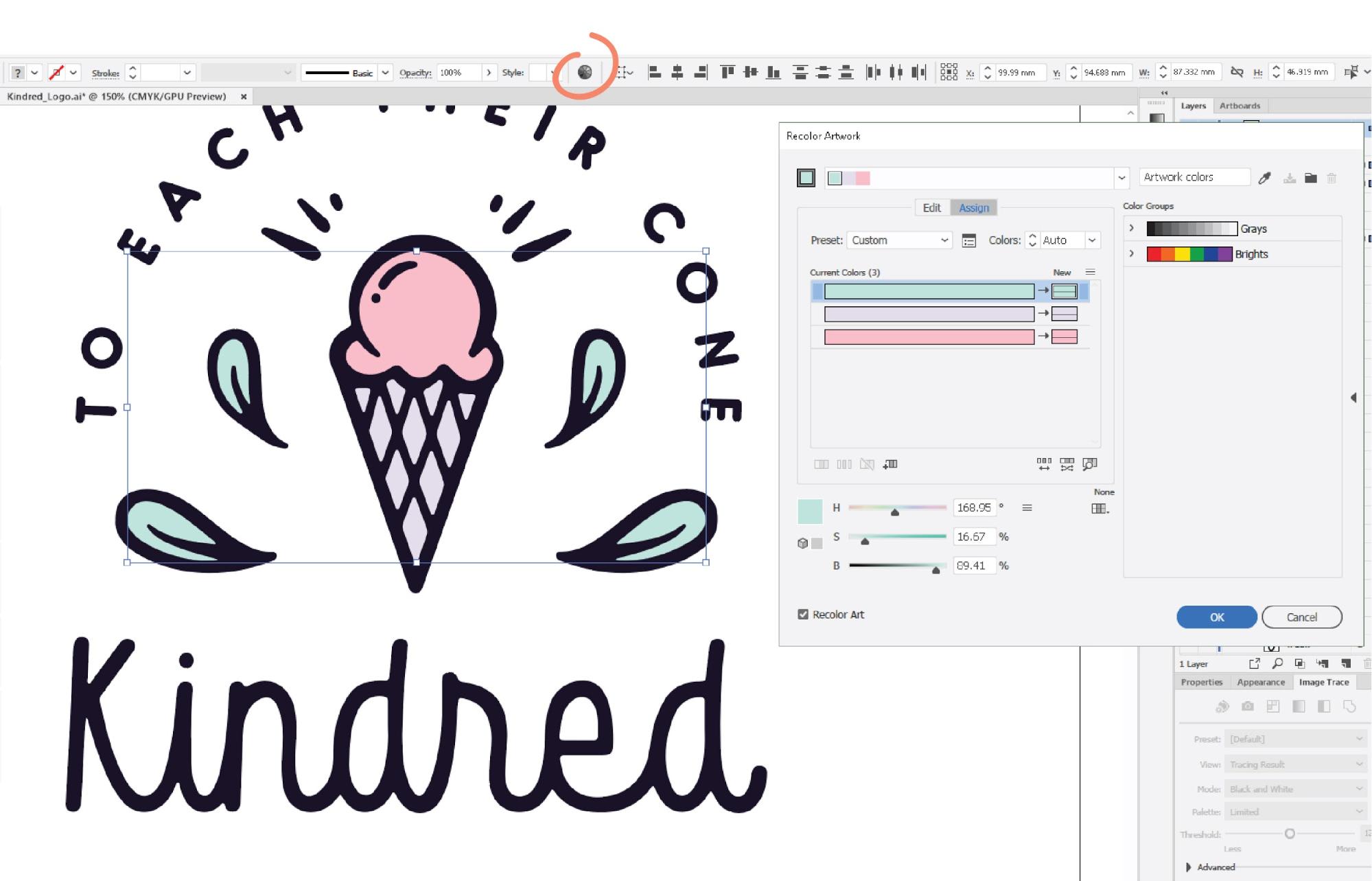
Step 6: Apply color
Color determines the feel of your logo and branding, so take time experimenting. Thoughtful color choices help your logo communicate who your brand is and what you offer. Start with a black and white design to ensure the logo works without color.
If your design relies on color, it’s not strong enough. A great logo should work in solid black on a white background.
First, select the elements that need color. Then, click the Shape tool and hover over the shapes that need color. If it’s a closed path that can turn into a shape, you’ll see a light gray fill color. Use Illustrator’s Color Picker and Swatches panel to experiment with colors. Click Fill to open the Color Picker or the Swatches panel (Window > Swatches) to choose from preset colors.

Source: Logo design by Laara Bonn via 99designs by Vista
Test a small color palette of 2-3 colors, as more colors make your logo harder to reproduce and less versatile. Stick to your existing brand colors if you have them or choose colors that reflect your brand personality.
Source: Logo design by Laara Bonn via 99designs by Vista
Consider color theory, color psychology and logo color meanings: blue suggests trust and professionalism; green implies growth and sustainability; orange conveys friendliness and creativity; red communicates energy and urgency. Think about what you want your audience to feel when they see your brand logo.

Check color contrast and accessibility. Test your logo colors using a contrast checker to ensure they meet accessibility standards.
Should I design my logo in RGB or CMYK in Illustrator?
Design your logo in RGB to get bright, saturated on-screen colors, but always check how those colors translate to CMYK before sending anything to print. Because CMYK has a smaller color range than RGB, some shades won’t reproduce exactly, so run a quick test to ensure your logo looks great both in digital and in print.
Colors that look vibrant on-screen may appear dull in print, so always test your colors in CMYK mode before finalizing (File > Document Color Mode > CMYK Color). If your colors shift dramatically on printed business cards or marketing materials, adjust them in CMYK mode.
Step 7: Refine your logo design
This step in the logo design Illustrator tutorial is where you take rough vector shapes and turn them into a professional-looking logo design. Small adjustments make a logo feel balanced, intentional and polished. Check alignment and spacing between design elements, and smooth out uneven curves or angles. Test variations: sharper vs rounder, tighter vs looser spacing. Finally, use Illustrator’s alignment tools (Window > Align) to ensure elements line up perfectly.
Step 8: Create logo variations
A strong logo is a flexible, responsive system that works everywhere, from a favicon to a billboard. Create a few variations, like a horizontal layout, a stacked layout and an icon-only mark, along with full-color, black and white and single-color versions. Always test variations out in real-world applications before you finalize them.

Read our guide to logo sizes and dimensions for social media, websites and print.
Test your logo at small sizes like favicon size (16×16 pixels) and social media profile size. If details disappear, simplify your design. If you can’t recognize your logo when the Illustrator artboard is zoomed out to 10%, it will fail on a business card. Also test it at large scales like on a poster or a banner.
Step 9: Export your logo
Once your logo design is finalized, it’s time to export it for real-world use. Exporting properly ensures your logo looks sharp everywhere it appears, both in digital and print contexts.
Export multiple file formats to cover all bases:
- SVG files for digital use and infinite scaling—these vector files look perfect at any size.
- PDF or EPS files for print—these formats preserve vector quality and handle color modes well.
- PNG logos with a transparent background for social media, presentations and when you need to place your logo over backgrounds and other images—the most versatile file type.
- JPEG files for versatility and situations where you need a small file size.
How do I export a logo with a transparent background in Illustrator?
To export a PNG logo with a transparent background (so you can seamlessly place the logo on various backgrounds and ensure your logo retains a clean, professional look in print and digital applications):
- Go to File > Export > Export As
- Choose PNG as the format
- Check Use Artboards (this ensures you export just your logo, not the entire canvas)
- In the PNG options dialog, select Transparent under Background Color
- Click Export
Once your files are exported, you may also want an animated logo for videos or socials. You can create the artwork in Illustrator and then follow our guide on how to animate a logo.
Step 10: Test and deploy
Testing your logo in the real world prevents costly surprises later. It’s always better to spot issues before you print 500 business cards or order 100 branded T-shirts. Where will your logo appear: merch, packaging, social media or signage? Test your logo on mockups of these print items and digital uses. A logo that looks great on screen might not work when embroidered on fabric or engraved on a pen.
Test your logo across digital and print, from your website to your merchandise and marketing materials. Place it on mockups and test it at different sizes and on different colored backgrounds. Your logo should work on white, black, brand colors and busy or patterned backgrounds. If it disappears on certain backgrounds, create new versions with different treatments like a white border or solid background shape to ensure it stays visible.
Create a folder of clearly labeled logo files for different use cases. Organize by file type and purpose: Logo_Web/, Logo_Print/, Logo_SocialMedia/. Use descriptive filenames like “CompanyName_Logo_Horizontal_FullColor.png” so you (and anyone else) can find the right file quickly.
Finally, create a simple brand style guide so your logo is used consistently. Document which logo variations to use when, what your logo colors are (with exact hex codes and CMYK values), minimum size requirements and clear space rules around the logo.
Logo design checklist
Use this “Zero-Error” checklist to make sure your logo is ready to be rolled out and won’t run into issues down the line:
- Works in full color, single color and black and white
- Remains recognizable at 16×16 pixels (favicon size)
- Scales to large sizes without losing quality
- Looks good on white, black and colored backgrounds
- Thin lines are still visible when printed
- Has been tested on mockups of real products (business cards, apparel, posters)
- Text is readable at all sizes
- Files are organized and clearly labeled
- All fonts have proper commercial licensing
- Colors have been tested in both RGB and CMYK modes
- Multiple file formats have been exported (SVG, PNG, PDF, JPEG)
- Transparent PNG versions have been created
- A brand guide has been written documenting logo usage rules
How to create a logo outside of Illustrator
Illustrator is powerful but it’s not the only path to a great logo. If you’re not ready to invest the time learning Illustrator or you want to explore styles quickly, logo makers and generators like VistaPrint’s Logomaker help you browse logo design concepts using AI. These tools are particularly useful for testing color palettes, shapes and layouts or for small business owners who need a logo fast.
Want to create your own logo quickly? Read our guides to AI logo design and the best logo design apps.
If you’re a design beginner and would rather work with a designer, connect with a professional via 99designs by Vista or VistaPrint’s logo design services to bring your vision to life.

Your logo is ready. Now what?
Now you know how to create a logo in Illustrator step by step, from sketching ideas to testing on real-world items, you’ll avoid costly mistakes and ensure your logo performs everywhere your business needs it to. Once you’ve finalized your logo design, apply it across your business cards, website, social media, packaging, merch, signage and other touchpoints. The time you invest now in getting it right pays off every time someone sees your brand. But remember that your logo is just the beginning of your visual identity.
