How do you make your product look premium without increasing costs? Minimalist packaging starts with one move – remove what doesn’t need to be there. Less material, less ink, fewer distractions. And as a result, you’ll get packaging that’s cheaper to produce and easier to trust at a glance.
In this guide, you’ll learn how minimalist packaging design works in practice, from core choices like typography, color and materials to the real benefits for small businesses. We’ll walk through a clear, step-by-step process and share simple packaging ideas you can adapt to your product without overcomplicating things.
- Minimalist packaging is a focused design approach that keeps only essential elements to communicate clearly and efficiently.
- Core principles of minimalist packaging design include intentional reduction, clear hierarchy, controlled color, strong typography and material-driven detail.
- The benefits of minimalist branding are lower production costs, stronger perceived value, clearer messaging and better alignment with sustainability trends.
- Keys to minimalist design include: defining a single message, simplifying structure and content then building the design around clarity, consistency and material choices.
What is minimalist packaging?
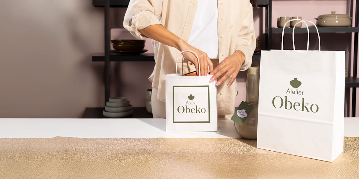
Minimalist packaging is a design approach that reduces product packaging to what actually matters – clear information, deliberate visuals and materials that serve a purpose, without decorative extras.
Every element is intentional: if it doesn’t support clarity, usability or brand identity, it’s removed.
In practice, minimalist packaging design uses structured layouts, tightly controlled color palettes and typography that does the heavy lifting. There’s no clutter, and there’s no visual competition. Key details are easy to find, the brand is instantly recognizable and the overall look feels calm, balanced and well-resolved.
Minimalist packaging is built on restraint, where every design choice is deliberate rather than decorative.

Source: Packaging design by goopanic via 99designs by Vista
Core principles of minimalist packaging design
Minimalist packaging may look effortless, but it’s built on a series of deliberate decisions. Remove too much and the design feels unfinished. Add too much and the message gets lost. The balance comes from a set of principles that shape what stays, what goes and how everything works together.
1. Reduction with intention: Every element must earn its place
Minimalist packaging design starts with editing. Forget guesswork and trends – you just need to focus on a clear filter: does this element serve a purpose?
If the answer is no, it’s removed. What remains is tightly defined and easy to justify:
- Logo
- Product name
- One key differentiator, such as a benefit or ingredient
This forces clarity early in the process. Instead of layering more information, you sharpen what’s already there.
The goal of this principle is intentional simplicity. The design feels complete, not empty, because every element has a role.
Before finalizing your design, try the “cover test.” Hide one element at a time. If nothing changes in how the product is understood, you probably don’t need it.

Source: Packaging design by monostudio via 99designs by Vista
2. Visual hierarchy: One clear focal point
As soon as you lock in the essentials, you need to structure them. Visual hierarchy determines how the design is read at a glance.
Strong minimalist branding usually revolves around one dominant message. Everything else supports it without competing.
You build that structure through a few controlled variables:
- Size: Larger elements draw attention first
- Placement: Top or center positions signal priority
- Spacing: More space around an element increases its importance
When these cues are aligned, the design becomes intuitive to scan. You need to ensure there’s instant understanding. A customer should grasp what the product is within seconds, even from a distance or on a crowded shelf.

3. Negative space: Let the design breathe
With hierarchy in place, space starts doing real work. Negative space, the areas left unfilled, defines how the design is read.
It separates content, sharpens readability and keeps elements from merging into a single blur. With less for the eye to process, the message lands faster. It also brings a sense of precision that often signals higher quality.
In minimalist packaging, space replaces the need for added detail. It establishes clear structure, draws attention to what matters and keeps the overall composition easy to navigate.
4. Limited color palette: Clarity over complexity
Color can either anchor a design or overwhelm it. Minimalist packaging keeps it in check by working with a narrow palette.
Most systems rely on one or two primary colors supported by a neutral base. This keeps the look consistent and makes the brand easier to recognize across different products.
Source: Packaging design by goopanic via 99designs by Vista
Instead of adding more colors, contrast does the heavy lifting:
- Light versus dark
- Matte versus gloss
- Bold accents against muted backgrounds
This approach keeps the design visually engaging without introducing noise.
Fewer colors often mean simpler production and lower printing costs, which is especially useful for small businesses testing new products or short runs.
5. Typography-first design: Let type do the heavy lifting
As color and graphics are reduced, typography takes center stage. In many minimalist packaging design systems, type carries both the message and the visual identity.
The goal is clear communication. The customer shouldn’t have to interpret or search for key information.
This requires discipline. One or two fonts are usually enough – variation comes from how they’re used, not how many you include.

Source: Packaging design by goopanic via 99designs by Vista
Source: Packaging design by goopanic via 99designs by Vista
Hierarchy is usually created through:
- Size differences between headings and supporting text
- Weight changes, such as regular versus bold
- Spacing that improves readability without crowding
When done well, typography replaces the need for decorative elements entirely.
6. Materiality as design: Texture replaces decoration
As printed elements step back, the material itself takes on a bigger role. It moves from being just a container to becoming part of the design.
Instead of adding graphics, interest comes from texture and finish. For example, kraft paper, textured cardstock, matte or soft-touch coatings. These choices add depth without visual clutter.
Materials also signal quality through feel, which is often more immediate than anything printed.
Source: Packaging design by Replika_ via 99designs by Vista
7. Material innovation: The new minimalism
Once material becomes part of the design, the next decision is what that material says about the product. Minimalist packaging has moved beyond surface-level simplicity. The focus now includes origin, lifecycle and impact.
This is where sustainability comes into play. Clean design already avoids excess. The next step is choosing materials that reduce waste and align with how modern brands operate.
Many minimalist solutions already cut down on unnecessary components. New materials take that further:
- Unbleached or recycled fibers with a natural finish
- Mushroom-based packaging as an alternative to foam
- Seaweed films for flexible, compostable wraps
These materials work well within minimalist packaging design because they don’t rely on added treatment to feel complete. Their raw finish and structure carry the visual weight without extra layers.
Benefits of minimalist packaging design
At this point, minimalist packaging might feel a bit strict. Fewer elements, tighter choices, less room to “just add one more thing.” But those constraints are exactly what make it effective. When applied well, minimalist packaging design sharpens how it shows up, how it’s understood and how it’s remembered.
Here’s what it looks like in practice:
- Creates a premium perception: Clean, controlled design signals confidence. When a brand resists over-explaining or over-decorating, it often reads as higher quality, which is why minimalist branding is so common in luxury categories.
- Reduces production and printing costs: Fewer colors, less ink and simpler finishes make packaging easier and cheaper to produce. For small businesses, this can mean lower upfront costs and fewer complications when scaling or reordering.
- Improves clarity and customer trust: Straightforward layouts make information easy to find and understand. Customers don’t have to dig for key details, which builds transparency and makes the product feel more reliable.
- Enhances product focus and shelf impact: By removing distractions, minimalist packaging directs attention to what matters most. On a crowded shelf, that clarity can stand out more than a visually busy design.
- Supports sustainability and eco-conscious branding: Using fewer materials and simplifying production naturally reduces waste. Combined with thoughtful material choices, this approach aligns with growing demand for more responsible packaging.
Minimalist vs. maximalist packaging design: What’s the difference and how to choose between the two?
Minimalist packaging design brings a lot to the table, but it’s not a universal fix. Some products need more energy, more detail, more visual intensity to land properly. In those cases, dialing everything down can actually work against you.
That’s where maximalist packaging comes in.
Source: Maximalist packaging design by goopanic via 99designs by Vista
Maximalist packaging design leans into abundance. It uses bold color combinations, layered graphics, dense information and expressive typography to create a strong, often immediate emotional response. Instead of editing things out, it builds visual richness through contrast, detail and storytelling.
You’ll often see:
- Bright or clashing color palettes
- Multiple graphic elements or patterns
- High information density, including claims, badges and descriptors
- Type used in varied styles and sizes across the surface
It’s louder by design. The goal is to grab attention quickly and communicate as much as possible in a single glance.
So how do you decide which direction makes sense for your product?
Here’s a practical way to think about it:
| Choose minimalist packaging when… | Choose maximalist packaging when… |
| You’re in wellness, skincare or luxury categories. | You’re targeting youth-driven or highly expressive audiences. |
| Your brand focuses on sustainability or transparency. | You’re competing in crowded retail environments that reward boldness. |
| Your product has one strong, clear message. | Your product benefits from storytelling or multiple selling points. |
| You want a calm, refined shelf presence. | You want high visual energy and immediate attention. |
| You’re launching limited editions or curated drops. | You’re building a playful or trend-driven brand identity. |
Still, this isn’t a strict divide. Many brands land somewhere in between. A clean layout with a bold color accent, or a minimal structure paired with expressive type can work just as well.
The idea is that you don’t need to commit to one approach. Instead, use what fits your product, your audience and the space you’re selling in.
How to create minimalist packaging design (step-by-step)
If you decide to stick with the minimalist aesthetic, you need to know the best practices to execute the packaging design right. Clean design leaves no room to hide mistakes. Every choice is visible, which means every step needs to be deliberate.
Let’s break the process down into something you can actually follow.
Step 1: Define your primary packaging message
Start with a single question: what does this packaging need to communicate first?
Usually, it comes down to one of three things:
- Brand name
- Product type
- Key benefit, such as “organic,” “handmade” or “SPF 50”
Since this decision shapes everything that follows, from layout to typography, it’s essential that you pick one priority and commit to it.
Remember, trying to say everything at once leads to clutter – minimalist packaging works because it focuses.
Step 2: Choose a standard packaging format and size
With the message set, move to structure. The goal here is to find the simplest format that fits your product without overcomplicating production.
Common options include:
- Box: Sturdy, stackable, ideal for retail and shipping
- Pouch: Flexible, lightweight, often used for food or refill products
- Sleeve: Adds branding to an existing container without full coverage
- Label: The most minimal option, applied directly to the product
- Wrap: Lightweight coverage for items like soaps or small goods
When choosing the packaging format, think beyond appearance. Consider how the packaging will be stored, shipped and used.
Stick to standard sizes where possible. Custom dimensions can quickly increase costs and complicate logistics.
If you’re weighing format options or need more guidance, check out these custom product packaging design tips for practical direction before you commit.
Step 3: Define the minimum required content (and remove the rest)
Once you have your packaging canvas all ready to work, you need to decide what actually needs to go on the packaging.
Start by listing everything:
- Product name
- Ingredients or materials
- Legal or regulatory information
Then cut aggressively – anything repetitive or non-essential should go.

Source: Packaging design by Senchy via 99designs by Vista
Short, scannable text beats long descriptions every time. Keep in mind that your goal here is clarity, not completeness.
Move secondary information off-pack (QR code approach)
If you still need to provide more detail, don’t force it onto the packaging.
Keep the surface clean and move extended content elsewhere. A small QR code can link to:
- Your website
- A product page
- Instructions or usage guides
This approach keeps the design focused while still giving customers access to deeper information.
Tools like VistaPrint’s built-in QR code generator make this easy to implement on packaging design without extra setup.
Step 4: Build a simple front-facing layout
Even effectively trimmed down content needs to be placed well on the packaging to work its wonders.
Start with the front-facing surface, the part people notice first. Keep it focused:
- Logo
- Product name
- One supporting detail
That’s usually all you need.

From there, it’s less about adding and more about holding back. The empty space isn’t something to fix – it keeps the layout clear and easy to scan. Let spacing separate elements and guide the eye instead of relying on lines or extra shapes.
Decide on alignment early and stay consistent. Centered layouts feel calm, grid-based ones feel structured. Mixing both tends to look unintentional, even when everything else is done right.
Step 5: Select a 1–2 color print setup
Once the layout is in place, it’s time to think about color. This is where keeping things simple really starts to work in your favor.
Stick to a tight palette:
- One primary brand color
- One neutral, like white, black or kraft
That’s usually enough to create a strong, recognizable look. What matters more is contrast. The text should be easy to read at a glance, without any guessing or squinting.

Source: Packaging design by Replika_ via 99designs by Vista
Check your printing method early. Digital and offset handle color differently, and that can impact both how it looks and how much it costs.
Step 6: Choose 1–2 fonts and define type hierarchy
Next up, the ever-so-important font choice. Typography carries most of the communication in minimalist packaging design, so it needs to be precise.
Assign clear roles:
- Font 1 for the product name or headline
- Font 2 for supporting information
Then build hierarchy through size, weight and spacing. This keeps the layout readable without adding extra elements.
Always test your type at actual packaging size. What looks clean on screen can become cramped when printed.
Source: Packaging design by goopanic via 99designs by Vista
Step 7: Select material and finish instead of adding graphics
At this stage, resist the urge to “add something extra.” If the design feels flat, the answer is rarely more graphics.
Instead, refine the material and finish:
- Kraft for a natural feel
- Matte for a clean, modern look
- Textured stock for a more tactile, artisanal finish

Source: Minimalist packaging design by zelda zgonck via 99designs by Vista
You can also introduce subtle enhancements like embossing, debossing or soft-touch coating. For a deeper look at options, explore this guide to every type of packaging material before finalizing your specs.
Step 8: Test your design using the “3-second clarity check”
Before printing, step back and test the design.
Ask yourself:
- Can someone understand the product in three seconds?
- Is the main message obvious without explanation?
Check both on-screen and on a printed mockup. Remember, in retail settings (as well as everywhere else) context matters a lot.
If there’s hesitation or confusion, simplify further.

Step 9: Print a small batch and refine
When your minimalist branding is ready, the final step is bringing it to life. But don’t commit to a full production run just yet.
Start with a small batch and test it in real conditions:
- Does the color match what you expected?
- Does the material feel right in hand?
- Does the packaging hold up during shipping and handling?
Use that feedback to make adjustments before scaling. Minimalist packaging leaves little room for error, so getting it right early saves time, cost and frustration later.
Go deeper with our package marketing guide for growing your business with standout packaging.
Simple packaging ideas for minimalist branding across industries
Once you understand the process, the next question is how to apply it. Different products come with different expectations, so the same minimalist approach won’t look identical across categories.
The good news is, a few focused packaging ideas can get you most of the way there without overcomplicating things.
Wellness & beauty
This category leans heavily on trust and perceived quality. Customers expect clarity, restraint and a sense of control.

Minimalist packaging design here usually leans on:
- White or neutral tones
- Ingredient-led labeling
- Clean, spacious layouts
The goal is to make the product feel transparent and easy to understand at a glance.
Source: Minimalist packaging design by goopanic via 99designs by Vista
Highlight one hero benefit only. Trying to communicate multiple claims at once weakens the message.
Artisanal food & beverage
For artisanal food and beverage, customers care about origin, ingredients and process. The packaging needs to surface that quickly without overloading the label.


Source: Minimalist beverage packaging design by Replika_ via 99designs by Vista
Kraft materials work well here because they already signal “unprocessed” and “small-batch.” Pair that with a simple label that clearly states product type, key ingredient or origin and one defining detail, like roast, flavor or method.
This keeps the focus on what people actually use to make a decision.
Source: Packaging design by CUPEDIUM via 99designs by Vista
Use clean typography and small icons to highlight specifics like roast level or dietary info. Full illustrations tend to compete with the product details instead of supporting them.
Apparel & accessories
For apparel and accessories, packaging often shows up in a different context – shipping, unboxing and returns. It needs to hold up in transit, feel good to open and still reflect the brand.

A simple structure works best:
- Rigid or foldable boxes for protection during delivery
- Reusable tote bags or dust bags for added value
- Plain mailers with a small, well-placed logo
Keep print minimal and consistent across all formats. This helps maintain a cohesive look from warehouse to customer.
Upgrade one tactile element instead of adding more graphics – thicker stock, a sturdier handle or a soft-touch finish. It’s more noticeable and holds up better over time.
Handmade & small-batch products
Smaller brands benefit from flexibility. You don’t need complex production to achieve a clean, consistent look.
Simple packaging ideas that work well:
- Plain boxes or pouches
- Stickers or labels with consistent placement
- Hand stamps for small runs
This approach keeps costs low while still supporting a cohesive minimalist branding system.
Ready to create a minimalist packaging design with maximum impact?
Minimalist packaging works when every decision is deliberate. You define a single message, strip back the noise and build around what matters. Layout, color, type and material all pull in the same direction.
Done right, it reads fast, looks considered and holds up across formats – on a shelf, in a box or in someone’s hands. It also scales. Fewer elements mean fewer production variables, which makes it easier to test, refine and grow without losing consistency.
If you’ve followed the process, you already have what you need: a clear message, a tight system and a design that earns its space. The next step is to put it into the real world and see how it performs.
Minimalist packaging and branding design FAQs
How do I design simple packaging on a budget?
Start with a standard box or pouch, use one-color printing and apply a well-designed label or sticker instead of full custom packaging. Focus your spending on material quality and legibility, not extras.
How minimal is “too minimal” in packaging design?
If customers can’t quickly identify the product, brand or key benefit, you’ve gone too far. Clarity always comes before aesthetics.
Can minimalist packaging still stand out on a crowded shelf?
Yes, especially when everything around it is visually busy. Clean layouts and strong contrast often draw attention faster than complex designs.
What role does branding play in minimalist packaging?
Branding carries more weight because there’s less around it. Your logo, type and color choices need to be consistent and distinctive to hold recognition.
Is minimalist packaging suitable for all product types?
Not always. It works best when the product has a clear message or benefit. Products that rely on storytelling or multiple features may need a more layered approach.
