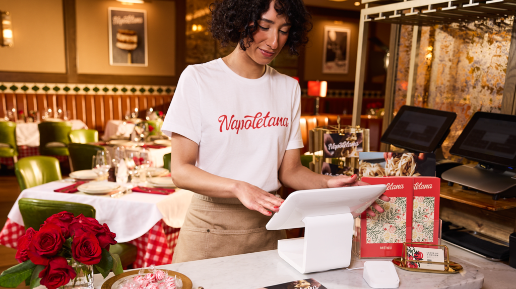
Your custom T-shirts are a walking billboard for your business, and the way you design them acts as a direct extension of your brand identity. Finding the right T-shirt design help starts with defining what you want your apparel to achieve.
Your design selection is one of the most important steps in how to print T-shirts, and it ultimately comes down to a careful balance of production budget, brand identity and the apparel’s final destination. This choice dictates how much you pay, how long your shirts are worn and how people perceive your business. Let us break down the differences so you can confidently print your next batch of custom shirts.
- Minimalist, text-only designs are highly wearable everyday wardrobe staples that carry much lower upfront screen printing costs.
- Complex illustrative graphics deliver a powerful visual narrative, making them the ultimate option for limited-edition merchandise or special events.
- Screen printing costs scale with color counts, making simple text layouts with one or two colors highly economical for bulk orders.
- Achieving a professional print depends on technical precision, including minimum 24pt font sizes and 300 DPI high-resolution files.
Typography vs. imagery: Core layout comparison
To make the best decision for your business, you first need to understand what defines each path. A text-only minimalist design relies heavily on clean typography, strategic letter spacing and plenty of empty space. This aesthetic signals sophistication and modern elegance. When customers or employees wear a sleek typography shirt, they often feel like they are wearing high-end retail apparel rather than a promotional uniform.

On the other hand, an illustrative graphic layout is all about visual storytelling. These designs feature hand-drawn artwork, vibrant color palettes and intricate brand icons. Graphic T-shirts are expressive, energetic and highly engaging. They don’t just state your brand name – they show your brand’s personality in full color.
While a text-only shirt builds brand authority through subtle sophistication, a graphic layout commands immediate attention in crowded spaces. The key is matching the layout to your specific business identity. Don’t let this limit your creativity – loads of T-shirt designs ideas use typography, graphics or both with engaging placements to create memorable apparel.
Here is a side-by-side look at how these two styles compare across style, use cases and print methods:
| Design type | Core aesthetics | Best for | Optimal printing method |
|---|---|---|---|
| Text-only minimalist | Clean, bold typography, ample white space | High casual wearability, lower production costs | Screen Printing / DTG |
| Illustrative graphic | Detailed artwork, vibrant colors, brand icons | Strong narrative impact, ideal for events | DTG / Screen Printing |

The production cost gap: Financial impacts of your layout choice
The complexity of your T-shirt design can have a major impact on production costs, particularly when color count, printing method and order size come into play.
Is it cheaper to print text-only T-shirts or graphic T-shirts?
The short answer is yes – it is generally cheaper to print text-only T-shirts than highly detailed graphic designs. This cost difference comes down to how different T-shirt printing technologies handle color and complexity.
If you choose traditional screen printing, your setup fees are determined by the number of colors in your design. Because each color requires its own custom physical screen, a simple text-only design with only one or two colors keeps setup fees to an absolute minimum. This makes minimalist typography incredibly cost-effective when you are ordering in bulk.
In contrast, a complex graphic illustration often requires a multi-color setup with five, six or even more screens. If you opt for Direct-to-Garment (DTG) printing instead to capture all those vibrant colors, you will skip the physical screen fees but pay a higher flat, per-unit cost. DTG printers must deposit dense layers of cyan, magenta, yellow and black (CMYK) inks, which drives up the production time and material cost per shirt.
If you are ordering more than 12 shirts, stick to a 1-color text design to unlock the massive volume discounts of screen printing.
The wearability lifecycle: Maximizing your apparel ROI
To truly maximize your return on investment, you want those shirts to be worn repeatedly out in the world, acting as free local marketing. Interestingly, the balance of typography versus imagery on a garment directly dictates its wearability lifecycle.
Minimalist text layouts make versatile, everyday wardrobe staples. When a T-shirt features clean, modern typography and plenty of breathing room, employees and customers are far more likely to pair it with jeans for a casual weekend outing. It blends effortlessly into their daily lives, giving your brand consistent, long-term exposure.
Conversely, dense graphic layouts are fantastic for targeted, high-impact events like conferences, trade shows or product launches. In these environments, you need a bold, immediate visual statement to stand out in a crowd. While these artistic, detailed shirts have a shorter daily wearability lifecycle, they achieve maximum narrative impact when it matters most.

How to size fonts for text-only layouts
Creating a gorgeous, minimalist T-shirt is harder than it looks. Without graphics to hide behind, every letter must be absolutely perfect. To make sure your custom text survives the design screen and holds up through dozens of laundry cycles, you need to follow a few strict technical guidelines.
What printing method is best for a minimalist typography T-shirt design?
For bold, crisp text, vector-based screen printing is the gold standard. It places a solid, highly durable layer of ink onto the fabric, ensuring your lettering remains vivid and never cracks or fades. Direct-to-Garment (DTG) printing is also an excellent choice, especially for small orders or multi-colored text, but vector graphics are essential to maintain sharp, clean letter edges.
What font is best for a text-only T-shirt?
Modern sans-serif fonts like Montserrat, Helvetica or Arial are universally loved because they offer high contrast and incredible legibility. If you want to project a more traditional, high-end luxury brand image, thick serif fonts like Georgia or Playfair Display work beautifully. However, you should avoid ultra-thin script fonts at all costs, as their delicate lines tend to get lost in the printing process.
To guarantee your design looks as good on fabric as it does on your computer screen, stick to these production rules:
Typography production specs
- Minimum font size: Use at least 24pt for your primary text elements to guarantee legibility from a distance.
- Line stroke weights: Maintain a minimum of 2pt thickness to prevent fine lines from washing out or bleeding into coarser fabric weaves (like heavy cotton blends).
- Font categories: Clean sans-serifs provide maximum contrast, while thick serifs support high-end minimalist branding. Never print ultra-thin script fonts.

Designing with impact: Best practices for illustrative graphics
If you have decided that a bold, illustrative layout is the right fit for your brand, you are on your way to creating something highly memorable. However, moving from a digital canvas to a wearable piece of art requires careful, technical preparation.
How big should my T-shirt design be?
For a standard full-front print, your graphic should ideally measure between 10″ x 10″ and 12″ x 12″. This specific size range ensures the design looks perfectly balanced across a wide variety of garment sizes, from small to double-extra-large. If the design is too small, it looks like a floating postage stamp, if it is too large, it wraps awkwardly around the sides of the body.
Resolution is critical
To protect the edge sharpness of your artwork, always export your files as a transparent PNG at 300 DPI (dots per inch) or supply native vector files like .AI or .EPS. Finally, practice smart color management. By limiting your illustration’s color palette, you will keep printing costs lower and maintain sharp visual contrasts. This also helps prevent color migration, which is when heavy garment dyes bleed into your printed inks, particularly on polyester blends.
Blending the elements: How to layout text and images together
What if you do not want to choose? For many small businesses, the sweet spot lies right in the middle: combining a clean business name or slogan with a striking visual icon.
When deciding how to layout text and images together, established design hierarchy rules should guide your placement. One classic approach is to arch your typography gracefully over a circular central graphic, which creates a classic collegiate or vintage feel. Alternatively, you can place a clean, modern wordmark directly below your brand icon to anchor the design and give it a polished, professional look.
No matter which layout you choose, always maintain a clear spacing buffer around your text. A distinct boundary between your typography and your illustration removes clutter, ensuring both elements are readable from a distance.
Don’t rush a good design. Before committing, take some time to review our fresh “How to design a T-shirt guide”.
Tell your brand’s story
Your custom apparel is a powerful way to tell your brand’s story. The right choice for your small business ultimately depends on your production budget, your wearability goals and your technical file preparation. By taking the time to set up your design files cleanly and choosing your fonts and sizes with care, you will guarantee a professional, high-quality custom T-shirt that your team and customers will love to wear.
T-shirt design help FAQs
How should I choose a T-shirt color for my design?
Choose a shirt color that reflects your brand while creating enough contrast for the design to stand out. Dark artwork is clearest on light shirts, while light or brightly colored designs pop against darker fabrics. Always preview the complete color combination before ordering.
Should I order a sample before placing a bulk order?
Yes. A printed sample lets you check the shirt’s fit, fabric, colors, print placement and overall quality. It may add time and cost upfront, but it can help you catch expensive problems before committing to a large order.
Can I use any font, image or illustration on a custom T-shirt?
Not necessarily. Make sure you own the artwork or have permission to reproduce it commercially. Fonts, stock images and illustrations can carry different licensing restrictions, so review their terms before printing or selling your shirts.
How do I choose the right T-shirt fabric for my design?
Cotton provides a smooth, comfortable surface that works well with many printing methods. Blended and performance fabrics can offer extra stretch or moisture control but may require more specialized printing. Consider comfort, durability and the shirt’s intended use alongside the design itself. Check out our guide to the best T-shirt fabrics for printing.
Should I offer more than one T-shirt design?
Offering a small selection can help you appeal to different tastes without making ordering overly complicated. For example, you could provide a subtle text-only option for everyday wear and a more expressive graphic version for customers who prefer a bolder look.

