
A great design starts with a solid graphic design layout. The way elements are placed shapes how people see, digest and respond to your message. Get the layout and composition right, and your flyers, business cards and website will look premium without extra cost. In this guide, we’ll cover the key principles of layout, including balance, hierarchy, white space and contrast, and practical steps to achieve effective layout in graphic design for any print or digital project. Read on to ensure your marketing materials stand out for all the right reasons!
- Graphic design layout is the placement of visual elements that shapes how people respond to your message, influencing customer perception, conversion and brand consistency.
- The core principles of layout in graphic design are balance, alignment, proximity, hierarchy, contrast, repetition and white space.
- The main layout types are grid-based, asymmetrical, modular, hierarchical and mixed.
- To create strong layouts, sketch wireframes, apply grids, balance content and refine spacing.
- Common layout mistakes include clutter, misalignment and low contrast.
What is a graphic design layout?
Layout in graphic design refers to the arrangement of visual elements—text, images, colors and white space—within a design, whether it’s print or digital. It’s the structure that guides how audiences absorb information, where their eyes move, what their perceptions are and what they remember.
For small businesses, effective layout and composition has the ability to make a flyer easy to read, help website visitors find what they need quickly, convert browsers into customers or turn business cards into a persuasive brand pitch.
Here’s why layout in graphic design matters:
- Builds credibility: A professional layout signals quality and makes your business look trustworthy.
- Improves readability: A clean structure makes information easy to scan and digest.
- Directs attention: Smart placement of elements guides the eye to what matters most, e.g. CTAs.
- Strengthens branding: Consistent layouts create a visual language your audience recognizes.
- Drives action: Clear graphic design layouts encourage engagement, from reading to buying.
Every graphic design layout decision has a ripple effect. Over time, even the smallest details accumulate to shape how customers see your brand—whether they trust it enough to act and whether they return.
Core principles of layout in graphic design
Whether you’re designing a booklet, a menu or a business card, the core principles that make graphic design layouts clear and consistent are the same.
Balance
Balance is how visual elements are shared across a design. When text and images are placed evenly, graphic design layouts feel easy to follow. If everything sits on one side of a flyer, for example, the design looks uneven and jarring, even if the reader can’t explain why.

A balanced business card design might have the logo on one side and contact details or a QR code on the other, creating a clean look. Similarly, when designing a restaurant menu, spread text and graphics evenly to make it easier for customers to read and digest the information.

Balanced business card design with a QR code
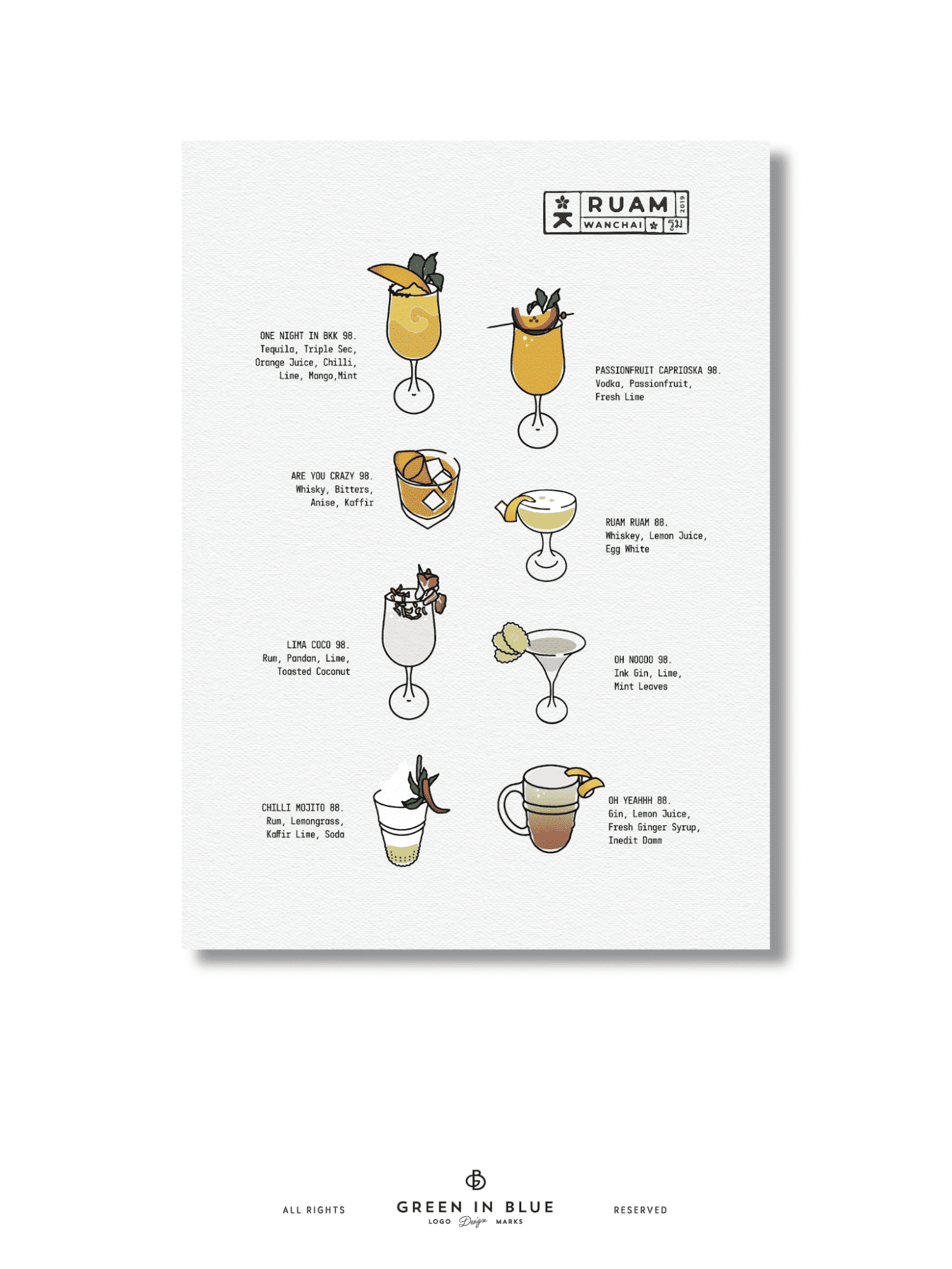
Source: Balanced menu design by green in blue via 99designs by Vista
Alignment
Alignment brings structure to graphic design layouts, creating clean visual lines that make information easier to scan, understand and remember. When design elements line up properly, nothing feels out of place and your target audience is more likely to trust your business.

Source: Brochure design with good alignment by MotivatedDesign via 99designs by Vista
For example, an email header with the logo and CTA neatly aligned keeps the reader focused on the message. Similarly, aligning headlines, subheadings and body text on a brochure gives it a crisp, professional look.

Proximity
Proximity refers to grouping related elements so audiences can quickly make sense of the content. When connected items like text and images sit close together, the relationship between them is clear without extra explanation needed.
For example, a product label that places the ingredients and illustrations in close proximity communicates faster than one that separates them. On a website, place the logo near the navigation links to keep everything within a comfortable visual reach and improve usability. When designing a custom mug, place the design and text elements close together to create a clear focal point.
Hierarchy
Hierarchy tells people where to look and what to read first, through size, weight and placement. It lends graphic design layouts a clear order, helping key messages to stand out.
On a poster, a bold headline catches attention before smaller supporting text. A landing page with a primary CTA button in a prominent spot leads visitors where you want them to go. When designing a photobook, hierarchy can guide how someone’s eye moves from images to captions and supporting text.

Poster design with effective hierarchy to communicate the discount first

Contrast
Contrast improves clarity. Elements that are distinct—through color, size or style—make key information more visible and therefore easier for the reader to to process.
Light text on a dark background improves readability, while a bold CTA on a white background stands out immediately. Strong contrast prevents important design elements from blurring into the background.

Repetition
Repetition lends design layouts a clear pattern. When certain fonts, colors or shapes appear in a predictable way, the design feels organized and purposeful, influencing brand perception and increasing customer loyalty.

White space
White space (or negative space) is the blank space around design elements. It gives design layouts breathing room, making them look clean and intentional. Without white space, even good content can feel overwhelming.
For example, a business card with space around the contact details looks more professional, printed marketing materials with generous spacing around text and visual elements get the message across more efficiently, and packaging or signage with just a logo and lots of white space are more visually appealing.


Types of graphic design layouts and use cases
The type of design layout you choose should reflect the project you’re working on, the message you want to communicate and the medium (print or digital). Here are the common layout types used in graphic design:
Grid-based layouts
Grid-based layouts use columns and rows to organize content, keeping elements aligned and easy to scan. These layouts bring instant balance to websites, flyers, posters and menus where clear structure matters.

To create a steady rhythm and guide the eye without effort, apply even spacing between blocks of content.
Asymmetrical layouts
Unlike grids, which bring structure and balance, asymmetrical layouts lean into considered imbalance to create energy and focus. Placing design elements unevenly can make a design feel more dynamic, while remaining clean and professional.

Source: Asymmetrical layout in a business card design by Terry Bogard via 99designs by Vista
Asymmetrical layouts work well for business cards, postcards and flyers that need to grab attention fast. An image on one side and text on the other creates a clear focal point and a natural path for the eye to follow.

A promotional postcard with an asymmetrical graphic design layout
Modular layouts
Modular layouts divide a page into flexible blocks, each containing content, whether visual or text. These graphic design layouts make it easy to organize information in a way that appears coherent and digestible.

An infographic with a modular graphic design layout
These layouts work especially well for infographics, posters, brochures, product pages and content-heavy websites. Each module acts like a building block, creating a clean, structured look that’s easy to navigate.
Poster with a modular graphic design layout
Hierarchical layouts
Hierarchical layouts rely on order. To achieve this layout effectively, make the most important information larger or bolder to ensure it grabs attention first, followed by supporting details in smaller or lighter text. This structure helps people process information in the order you intended them to, e.g. discounts first then context and URLs.

Retractable banner with a hierarchical graphic design layout
This layout type is ideal for banners, landing pages and websites where the main message needs to stand out. A strong headline at the top, followed by supporting text and smaller details, makes it clear what matters most.

Mixed layouts
Mixed layouts blend multiple structures—grids, asymmetry, modular blocks—to create flexible, layered designs. These layouts are great when you need variety and dynamism without sacrificing clarity. Flyers, posters and websites often use mixed layouts to highlight different elements while keeping the design clean.
A step-by-step guide to graphic design layouts
Now it’s time to put your knowledge of the principles of layout and composition and different layout types into action to create a clear graphic design layout that communicates your message quickly and effectively.
Step 1: Choose your tools and templates
Start with reliable design software. A good design tool makes it easy to apply grids, align elements and adjust spacing. Platforms like VistaCreate and the VistaPrint built-in editor offer ready-made grid templates, alignment features and drag-and-drop functionality—perfect for small business projects.

If you have experience of working with more advanced graphic design tools, programs like Adobe Illustrator or Figma are also solid options.
Step 2: Consider digital vs print graphic design layouts
Digital and print designs have different layout needs. Because a digital layout must adapt to various screen sizes, flexibility matters. Print layouts, on the other hand, demand precision—what you see on screen should match the final product exactly. Consider margins, bleed, image resolution and readability at actual print size before finalizing your design and sending it to print.
For print projects, set margins and bleed at the start. A safe margin of at least 3mm prevents design elements from being cut off, while bleed ensures backgrounds extend cleanly to the edge.
Step 3: Sketch wireframes
Sketch out the basic structure of your layout before diving into design choices. A wireframe lets you focus on and experiment with placement, structure and flow before you consider design elements like fonts or colors. Even a rough wireframe sketch can help clarify the layout of your design, making later design decisions easier.
Step 4: Apply grids
Grids give graphic design layouts a solid backbone, keeping elements aligned and spacing consistent. Whether it’s a simple two-column structure or a more complex layout, grids make your composition feel deliberate and look professional.
Step 5: Select fonts
Typography sets the tone of your design. Pick fonts that are legible and align with your brand. Apply the principle of hierarchy to your fonts—headlines, subheadings, body text—to guide the reader’s attention.
Step 6: Add images
Images anchor attention, so place them strategically. Use images to create balance, direct the viewer’s gaze or reinforce a key message. Make sure all images are high-resolution and work well alongside your text using the principle of proximity.
Step 7: Refine spacing
Adjust margins, padding and line spacing until the design feels stable and easy to scan. Considered spacing improves readability and gives your design layout room to breathe.
Step 8: Be consistent
Consistency is the key to strong branding. Whichever principles you prioritize and layout type you choose, make sure to apply them consistently across all marketing and branding materials, printed and digital.
Common layout mistakes and how to avoid them
| Mistake | Fix | |
|---|---|---|
| Clutter | Using too many design elements can visually overwhelm the viewer. | Use white space effectively and prioritize essential information. |
| Inconsistent alignment | Misaligned text and images can make a design look unprofessional. | Use alignment tools in design software to ensure elements are lined up neatly. |
| Poor contrast | Low contrast can make text hard to read and reduce accessibility. | Ensure a high contrast between backgrounds and text/CTA buttons. Use the Contrast Checker tool for improved accessibility. |
| Poor readability | Overly decorative or thin fonts can make information difficult to read and digest. | Use easy-to-read fonts and heavier weights. Consider who your target audience is and what you want their reading experience to be. |
Ready to master graphic design layouts?
Strong graphic design layouts and compositions make designs look good. Beyond that, they shape how well your marketing performs. A clear layout improves how people perceive your brand and how likely they are to act on your message. For small businesses, that directly impacts the conversion rate of every flyer, brochure, poster, social media post, website or landing page.
You now have the foundation to build effective graphic design layouts. Use these principles and steps to sharpen your designs and boost the quality of your marketing materials. And if you’d rather leave it to experts, professional designers can help you craft layouts that will engage and persuade.
