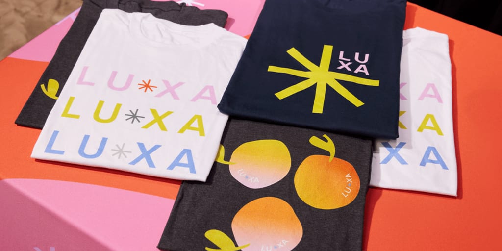
Promotional apparel and branded T-shirts should never feel like an afterthought. For small business owners, custom clothing serves as a mobile billboard that transforms clients, staff members and local supporters into active brand advocates. Yet the traditional approach of slapping a giant, centered corporate logo across a cheap shirt rarely succeeds anymore. Those shirts quickly find their way to the bottom of a closet or the scrap rag bin.
To create branded T-shirts that people eagerly wear in public, it’s best to treat your clothing line like a genuine retail product. This means shifting your mindset from basic promotional giveaways to intermediate, design-forward merchandise. By understanding modern aesthetics, fabric structural physics and ink varieties, you can produce premium lifestyle merchandise that tells a story and drives real-world engagement.
Let’s look at the baseline principles of modern apparel construction and explore 11 technical, highly scannable design layouts tailored for success.
- Choose the right fabric weight first. The GSM of your T-shirt affects how it looks, feels and performs with different print methods, so it’s the foundation of a successful design.
- Think beyond the front of the shirt. Many modern brands use subtle front branding with bold back graphics to create a more premium, retail-inspired look.
- Design for your audience. Matching the style, fit and graphics to the people who’ll wear your apparel makes it more appealing and more likely to become part of their wardrobe.
- Pair great design with quality production. Choosing the right print technique, garment style and sizing helps your T-shirts stay comfortable, durable and looking their best over time.
- Treat branded apparel as a long-term brand investment. With thoughtful planning, strong design and smart pricing, custom T-shirts can build brand recognition, strengthen customer loyalty and even become an additional source of revenue.

How fabric weight changes the look and feel of branded T-shirts
Before exploring T-shirt design ideas, sketching logos or selecting typography layouts, it’s a good idea to choose your garment canvas. The weight of a shirt fabric is measured in GSM (grams per square meter), which dictates how the textile drapes on the body, how it reacts to specific print methods and how durable the final product remains over dozens of wash cycles.
Selecting the wrong GSM can instantly ruin an excellent graphic concept. For example, a dense, complex multi-layered screen print will cause an ultra-lightweight shirt to sag and pucker.
We’ve collated a structural architectural matrix below to help map out the exact textile requirements for your custom apparel project:
| Fabric weight category | GSM range | Silhouette & garment drape | Ideal design & print applications |
|---|---|---|---|
| Lightweight canvas | 140–160 GSM | Fluid, highly flexible and body-skimming. Offers maximum breathability for high-movement environments. | High-turnover event giveaways, athletic wear, gym apparel and soft water-based ink discharge printing. |
| Midweight blank | 160–200 GSM | Standard retail drape. Balances structural integrity with everyday casual flexibility. | Personalized work uniforms, retail merch lines, detailed vector graphics and traditional direct-to-garment (DTG) printing. |
| Heavyweight structured | 200–240 GSM | Moderate stiffness with clean drape lines. Begins to square off the shoulders and mask undergarment lines. | Premium streetwear merchandise, local club apparel, bold typography shirt designs and high-density plastisol prints. |
| Ultra-heavy streetwear | 240–300 GSM combed cotton | Boxy, structured and rigid cuts. Holds its own distinct shape independent of body contours. | High-end luxury merchandise, custom puff ink logos, large-scale oversized back graphic mockups and embroidery. |
The “front vs. back” shift
A good T-shirt design is about more than where you place your logo. Before deciding on the layout, think about how your graphics, fonts and branding work together and who you’re designing for. Instead of relying on a large logo across the chest, many modern brands use thoughtful placement to create a more distinctive look, making the most of every part of the garment.
The golden rule of T-shirt branding: Modern apparel merchandise relies on balancing fabric density with placement strategy. For a premium retail aesthetic, pair a minimal front logo with an oversized back graphic on a heavy 240–300 GSM combed cotton blank; for high-movement promotional giveaways, opt for a breathable, flexible 140–160 GSM textile canvas.
By adopting this front-to-back philosophy, you create an initial premium look when viewed from the front. This restraint allows you to utilize the expansive, uninterrupted flat canvas of the back for rich illustrations, detailed brand statements or geographic coordinates.
11 technical examples of branded T-shirt layouts
1. Personalized promotional T-shirts
- Design aesthetic: Co-created interactive minimalism
- Placement zone: Left chest primary branding with modular sleeve print accents
- Fabric canvas: 180 GSM midweight ringspun cotton blank
- Target audience persona: Tech conference attendees, modern startup teams and event-goers
Allowing your audience to become part of the design process shifts their relationship with the garment from passive recipients to active co-creators. Instead of ordering uniform batches, build modular assets into your apparel print run.
You can utilize high-quality heat-press activation directly at a pop-up booth to apply personalized names, specialized sub-department text or custom icon patches onto the sleeve canvas. This approach creates immediate engagement at tradeshows while ensuring the garment feels like a customized, limited production piece rather than a mass-distributed corporate handout.
2. Limited edition artist collaborations
- Design aesthetic: Independent fine-art illustration
- Placement zone: Off-center front panel layout extending down to the bottom hem
- Fabric canvas: 220 GSM heavyweight raw unfinished cotton
- Target audience persona: Independent retail shoppers, art community supporters and collectors
Partnering with independent local illustrators or visual artists immediately injects external cultural relevance into your brand identity. This strategy treats the clothing as a blank canvas, but it’s important to avoid dictating strict logo placement guidelines to your creative partner
Instead, let their distinct illustration style lead the visual narrative, naturally integrating a subtle element of your brand typography into the artwork.
Limit the production run to a specific number and clearly stamp the batch information on the interior neck label or bottom hem line. This strategy creates a genuine sense of collector urgency, shifting your apparel from standard company merchandise into a highly desirable lifestyle piece that people proudly wear in premium social environments.

3. Branded T-shirts with a story or a cause
- Design aesthetic: Editorial content presentation
- Placement zone: Vertical left-aligned front typographic text with lower back information panel
- Fabric canvas: 160 GSM organic certified combed cotton blank
- Target audience persona: Mission-driven consumers, environmental non-profit groups and advocacy teams
When designing clothing that supports an advocacy initiative, a charitable partner or a founding brand narrative, it’s important to make sure the text is clear so people can easily read your message.
On the upper back panel, you could place an infographic design block that states clean, verifiable data regarding the cause, such as precise environmental impact metrics or community development milestones. Pair this textual layout with a scannable, high-density QR code placed cleanly on the wearer’s right sleeve or neck nape. This setup drives digital engagement, leading curious observers directly to a dedicated landing page where they can learn about the history of the project.
4. Interactive social media design campaigns
- Design aesthetic: Raw community-sourced graphic layouts
- Placement zone: Center chest artwork frame with lower back campaign markers
- Fabric canvas: 180 GSM midweight pastel blank
- Target audience persona: Digital native brand communities, social media followers and content creators
Transform your community into a crowd-sourced design studio by running interactive digital voting campaigns to choose your next seasonal shirt style. You could use your online networks to share raw, user-submitted artwork variants, allowing your core audience to directly choose the winning layout.
The chosen graphic layout should be preserved exactly as designed, showcasing authentic community flavors over polished corporate templates. Frame the front artwork cleanly, and utilize the lower back area near the hem line to place a small, high-contrast campaign text marker noting the community selection year.
5. Branded T-shirts featuring iconic quotes
- Design aesthetic: Handwritten font doodle shirts
- Placement zone: Centered upper back statement block with minimal front chest text
- Fabric canvas: 200 GSM heavy premium mineral-wash textile
- Target audience persona: Creative communities, indie coffee shop patrons and boutique brand fans
Move completely away from structured corporate taglines by utilizing expressive, hand-drawn typography to highlight meaningful brand sayings or community statements. Handwritten font doodle shirts remove the rigid, sterile look of standard corporate items, giving your merchandise a human touch.
[ FRONT CANVAS ]                         [ BACK CANVAS ]
+-------------------+                    +-------------------+
|                   |                    |    DOODLE TEXT    |
|  [Logo Text]      |                    |   "THE INSIDER    |
|  (Left Chest)     |                    |     PHRASE"       |
|                   |                    |   (Oversized)     |
|                   |                    |                   |
+-------------------+                    +-------------------+
Keep the front presentation extremely quiet with a single, clean word or year mark typed in a simple sans-serif font along the collarbone or left chest. On the reverse side, expand into bold typography shirt designs that display the quote alongside raw, organic illustrations and stylized borders. This stylistic contrast matches high-end retail clothing brands and turns your promotional merchandise into an everyday wardrobe staple.
6. Retro-inspired T-shirts tapping into nostalgia
- Design aesthetic: Vintage club group apparel
- Placement zone: Full center back illustration with matching left-chest emblem
- Fabric canvas: 240 GSM heavy boxy streetwear blank
- Target audience persona: Vintage apparel collectors, local athletic clubs and heritage brand customers
Tap into nostalgia by referencing the design styles of vintage outdoor clubs and summer camps. Use an established retro camp badge template that features circular geometric framing, stylized mountain or tools iconography, and distressed, aged text borders.
Avoid bright neon tones. Instead, choose a color palette of deep forest greens, warm ambers, cream whites and washed navies printed on an ultra-heavy, structured boxy canvas. Request a distressed screen texture effect during production to simulate decades of genuine wash wear. This classic execution immediately separates your business from typical corporate apparel, giving your brand a reliable, familiar and time-tested heritage feel.
7. Apparel that doubles as rewards or coupons
- Design aesthetic: Industrial cryptographic utility layout
- Placement zone: Interior lower hem line print with high-contrast chest branding
- Fabric canvas: 180 GSM midweight industrial monochrome textile
- Target audience persona: VIP clients, local retail regulars and brand super-fans
Turn your seasonal branded apparel into an ongoing customer loyalty program. Design a bold, industrial visual theme on the exterior of the shirt, but print a unique, high-contrast rewards track code or scan target directly onto the interior lower hem line or under the sleeve cuff fold.
This hidden layout allows you to establish ongoing real-world interactions. For instance, you can offer a standing retail discount or exclusive event entry whenever a staff member spots a customer wearing the shirt in your shop.
8. Photo-op-ready branded T-shirts
- Design aesthetic: High-contrast phygital optical mockups
- Placement zone: Oversized back graphic mockups with flipped mirror-selvedge front text
- Fabric canvas: 260 GSM heavy premium black combed cotton
- Target audience persona: Fitness communities, digital content creators and event organizers
Design clothing engineered specifically to capture attention across digital social spaces. Use oversized back graphic mockups that fill the entire shoulder blade area, providing bold visibility that stays perfectly legible inside phone cameras.
On the front panel, use a flipped typographic layout where your primary brand phrase or insider statement is printed backward. When a customer stands in front of a gym or retail mirror to snap a selfie, the reversed text displays correctly on their phone screen. This playful design mechanic encourages user-generated content, prompting wearers to post high-contrast snapshots that display your brand cleanly to their personal networks.
9. Reversible design concept layouts
- Design aesthetic: Dual-purpose tactical minimalism
- Placement zone: Double-sided interior/exterior full coverage printing
- Fabric canvas: Dual-layer interleaved 150 GSM lightweight cotton panels
- Target audience persona: Commuters, modern travelers and minimalist lifestyle consumers
Double the functional options of your custom clothing by building a double-sided garment layout. The primary exterior layer should display a high-energy design with large graphic assets or vibrant colored ink selections, perfect for active community events.
The interior layer features a completely inverted color palette and a minimalist layout, keeping the branding limited to a clean, small logo stamp on the back collar nape or side hem label.
10. Branded apparel with optical illusion designs
- Design aesthetic: High-density 3D structural dimension
- Placement zone: Upper center chest block or full back illustration canvas
- Fabric canvas: 280 GSM ultra-heavy boxy combed cotton cut
- Target audience persona: Tech startups, design agencies and modern streetwear enthusiasts
Incorporate 3D geometric design elements and perspective lines to pull eyes toward your graphics. Instead of using standard, flat ink prints, elevate this concept by specifying custom puff ink logos during production.
Puff ink utilizes a specialized foaming agent that expands under dryer heat, curing into a raised, tactile 3D finish that physically projects off the heavy cotton fabric canvas. This clean, structural element catches shifting room shadows and invites people to look twice, making it a natural conversation starter for businesses that want to highlight an edge in innovation or design.
11. Location-based branded T-shirts
- Design aesthetic: Hyper-local typographic cartography
- Placement zone: Center chest badge coordinate layout with upper neck branding
- Fabric canvas: 170 GSM faded pastel clothing blanks
- Target audience persona: Local neighborhoods, regional tourism crowds and community mainstays
Celebrate your neighborhood by designing apparel that highlights local regional pride over generic corporate marketing. Depending on the brand, use faded pastel clothing blanks in soft terracotta or vintage clay tones to give the apparel an authentic, sun-bleached look right off the rack.
Incorporate clean geographic coordinates pointing directly to your storefront’s front door, paired with minimalist neighborhood maps or retro transit badges. Keeping your corporate branding secondary to local pride turns the shirt into an exclusive community keepsake that residents and travelers wear with genuine local pride.
Looking for another way to promote your business? Explore our custom tank tops to create comfortable apparel for your team, giveaways or upcoming events.
Best practices for production and design
Once you have selected a design layout and mapped out your ideal fabric GSM weight, it’s a good idea to focus on production technicalities to ensure your graphics remain crisp, colorful and intact over time.
Specify advanced ink technologies
Avoid traditional thick plastisol inks on lighter shirt canvases, as they can create an uncomfortable, sweat-trapping barrier across the chest. Request a soft water-based garment ink for your lifestyle merchandise runs. Water-based inks work by chemically dyeing the fabric fibers directly rather than sitting on top of them. This process delivers an incredibly soft touch with zero heavy surface texture, allowing the garment to breathe while completely preventing the cracking or flaking that ruins aged shirts.
Build clear sizing matrices
When placing bulk apparel production orders for teams or promotional crowds, avoid ordering a single flat middle size. A balanced, real-world bulk size distribution breakdown that accommodates varying customer profiles typically adheres to a standardized curve:
[ S ]  10%  ███
[ M ]  25%  ████████
[ L ]  35%  ███████████
[ XL]  20%  ██████
[2XL]  10%  ███
Always request modern boxy cuts or retail-ready shapes over cheap tubular promo blanks, as modern shapes drape naturally around the waist and shoulders.
Strategic guidelines for selling branded T-shirts
If you want to move past free giveaways and turn your custom apparel line into a self-sustaining, profitable revenue stream, ideally, you need a clear commercial plan.
Ground your designs in audience analytics
Don’t assume you know what your community wants to wear. Quick digital polls or reviewing your active social media analytics is a great way to learn what color palettes, graphic styles and cuts resonate best with your existing customer base. Tailor your production to these proven visual tastes and you won’t go wrong!

Factor in apparel production timelines
Building a premium clothing line requires careful schedule planning. Map out your design and manufacturing steps against clear custom apparel shipping timelines to ensure your stock arrives ahead of key seasons. While simple digital print runs can clear production within days, advanced manufacturing processes such as custom puff ink treatments, multi-panel screen setups or specialized washing steps require three to four weeks of buffer time before an official launch.
Price for long-term profitability
Research your local market landscape to set retail pricing that accurately reflects the custom quality and uniqueness of your garment. For premium lifestyle items, aim for a clear 40–50% profit margin to successfully balance your upfront design fees, production costs and ongoing marketing spend.
FAQs about branded T-shirts
What is the best way to brand a T-shirt?
The most effective way to brand a shirt is to balance fabric density with a clean placement strategy, avoiding oversized corporate logos on the center chest. Keep your front branding minimal with high-quality embroidery or custom puff ink accents, and use the expansive back panel for rich graphic illustrations or community taglines that match real-world retail trends.
Where should a brand logo be placed on a shirt?
For a premium lifestyle look, place small brand elements on the left chest, center collar bone or back neck nape. This clean approach mirrors modern retail apparel, ensuring the logo acts as an artistic accent rather than a sales pitch. Reserve large center placement zones for expressive artwork or typography that connects directly with your community’s interests.
What makes a T-shirt look premium for merch?
Premium merchandise lines rely on high-quality blanks that feature thick combed cotton fabric, tight-knit patterns and modern boxy cuts. Look for manufacturers that offer ringspun cotton options, finished interior neck lines and durable double-needle stitching along the seams to ensure the garment maintains its shape through extensive wash cycles.
What is the standard sizing breakdown for bulk apparel orders?
A reliable bulk apparel ordering breakdown for general crowds follows a mid-heavy curve: 10% small, 25% medium, 35% large, 20% extra large and 10% double extra large. Adjust these baseline ratios if your target audience bends heavily toward specialized fitness communities or particular corporate groups.
How does fabric weight (GSM) impact print quality and durability?
Fabric weight determines how well a shirt supports different styles of garment ink. Lightweight textiles (140–160 GSM) work beautifully with soft water-based inks but can sag under heavy screen prints. Heavyweight structured cotton cuts (240–300 GSM) easily handle dense plastisol layers, high-density embroidery and custom puff ink elements without warping the garment’s shape.

